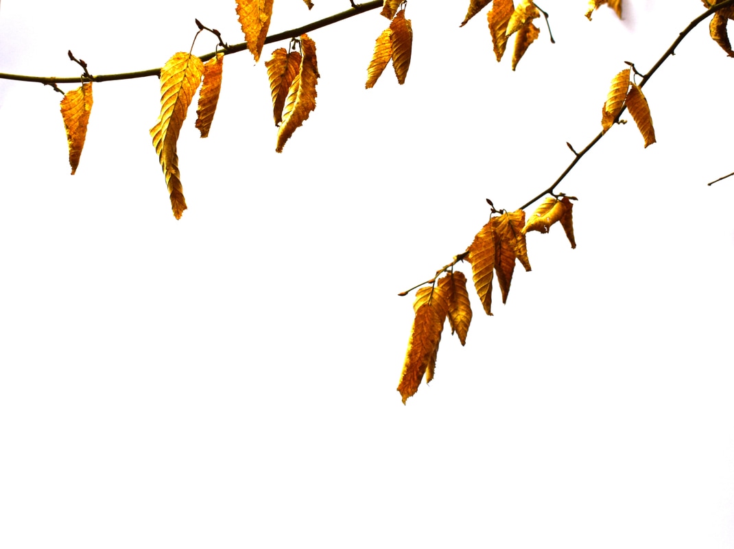
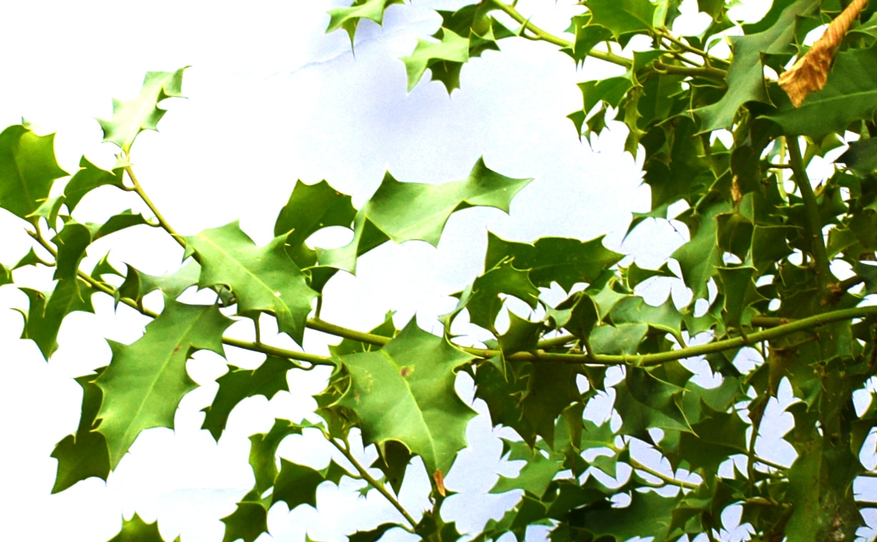
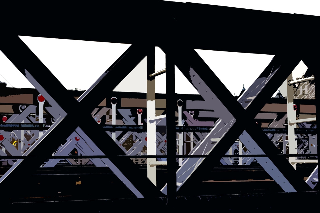
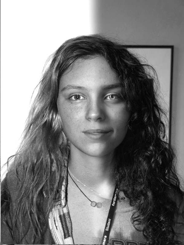
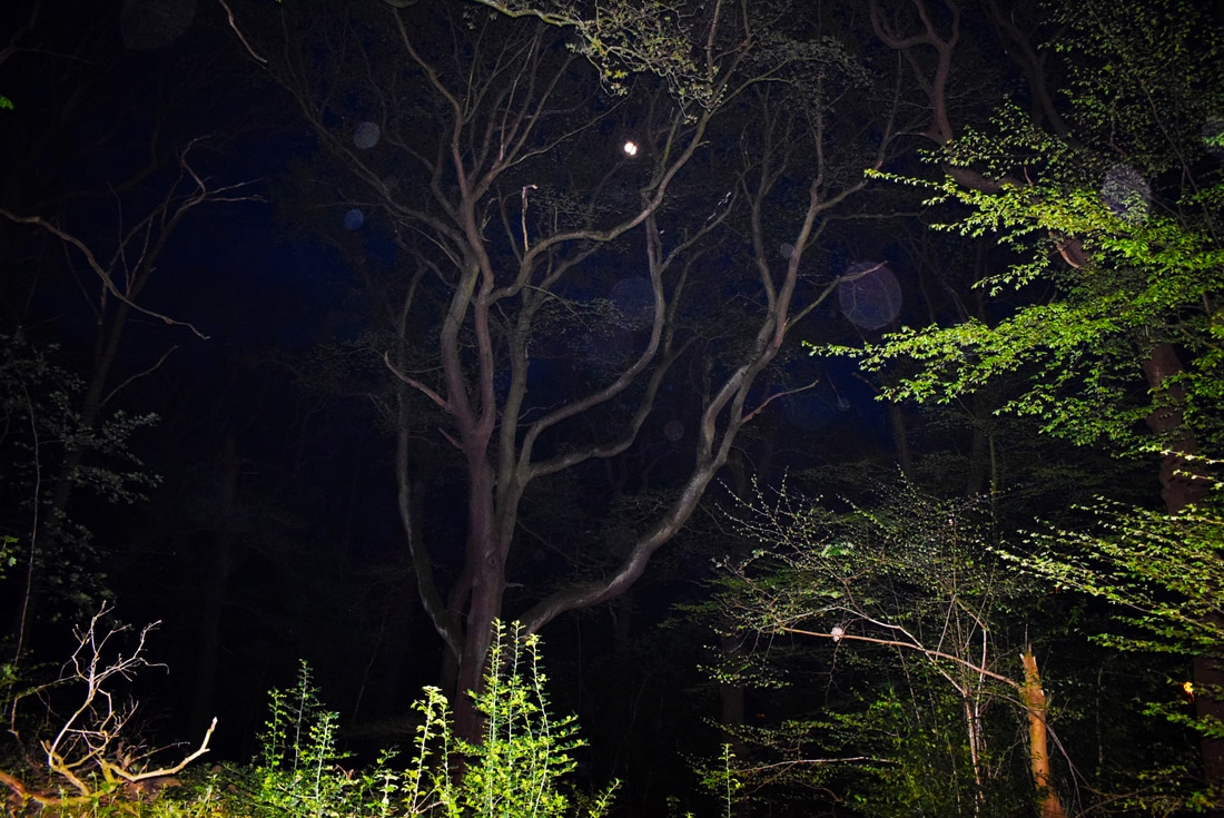
Structure in London
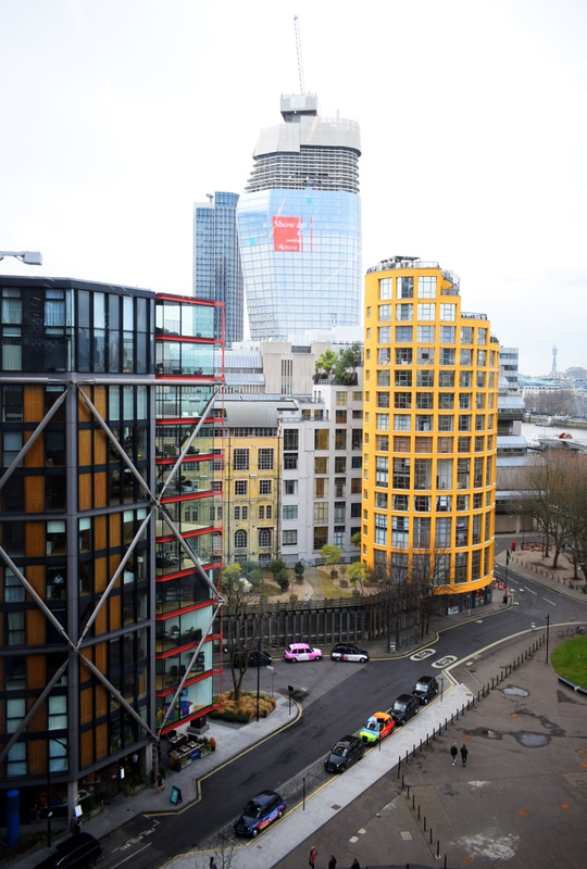
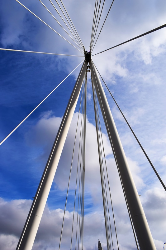
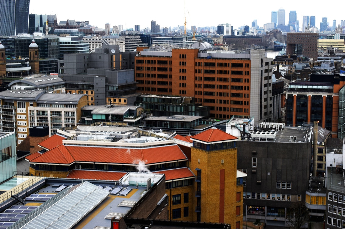
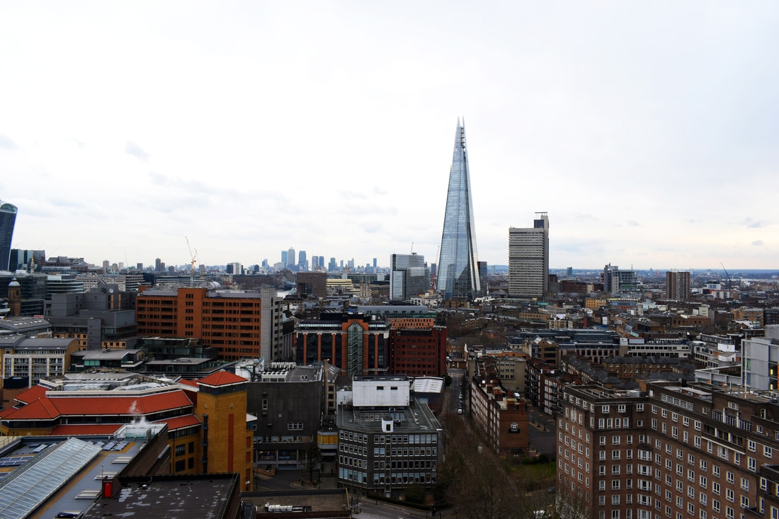


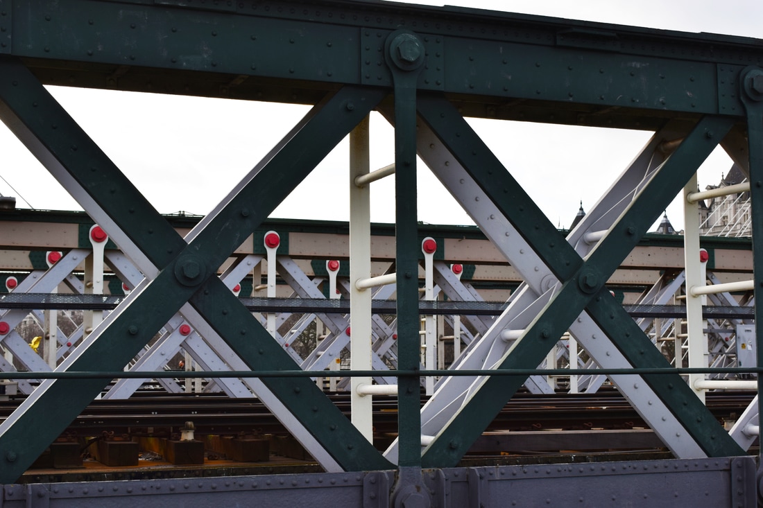
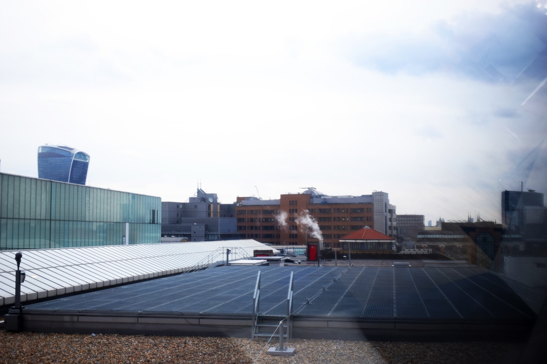
What appealed to me was intricate structures which had an aesthetic quality when photographed. I tried to take some at an interesting angle so it's more appealing to the viewer. Some were more successful than others due to lighting, colour and my positioning. I preferred the pictures of structure up close than images of the skyline from the roof.
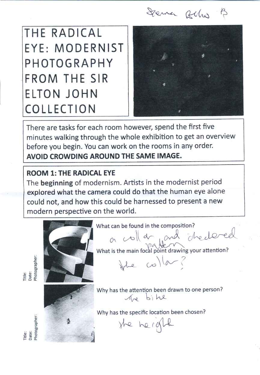
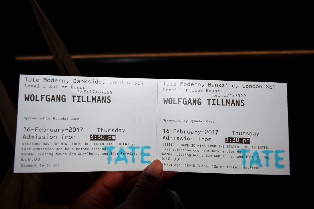
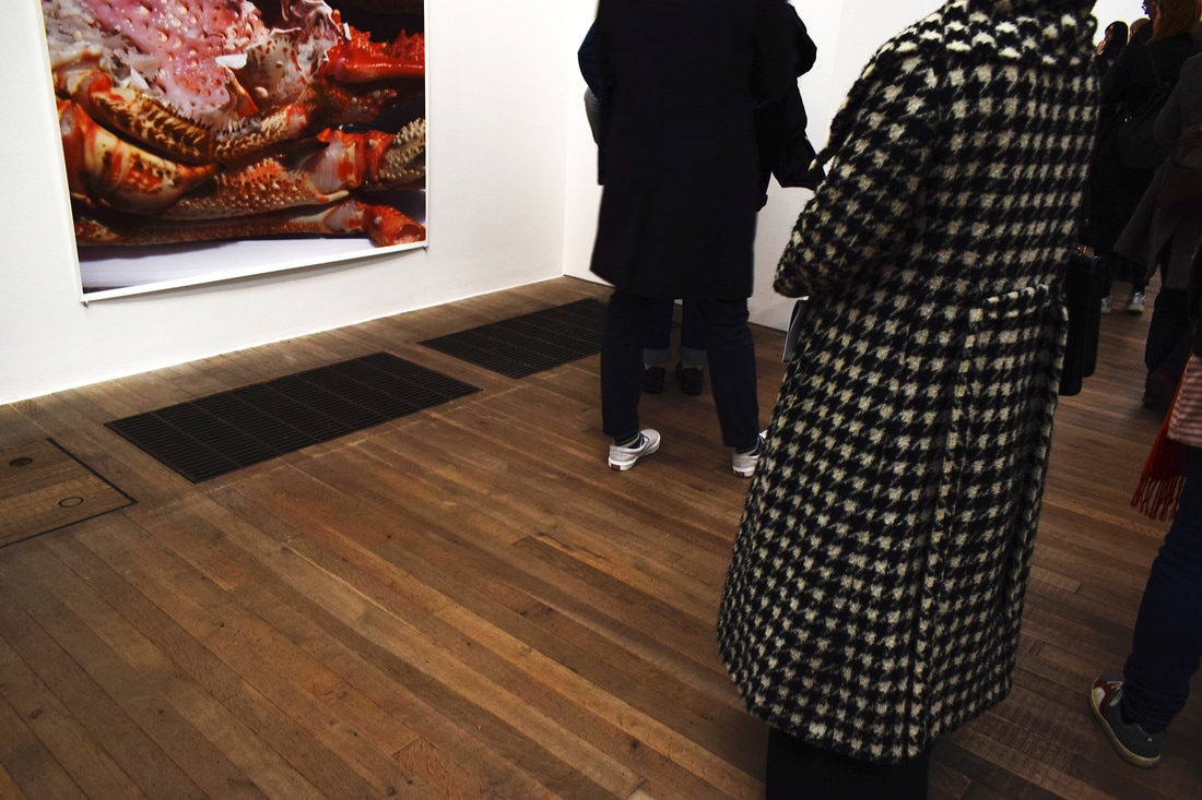
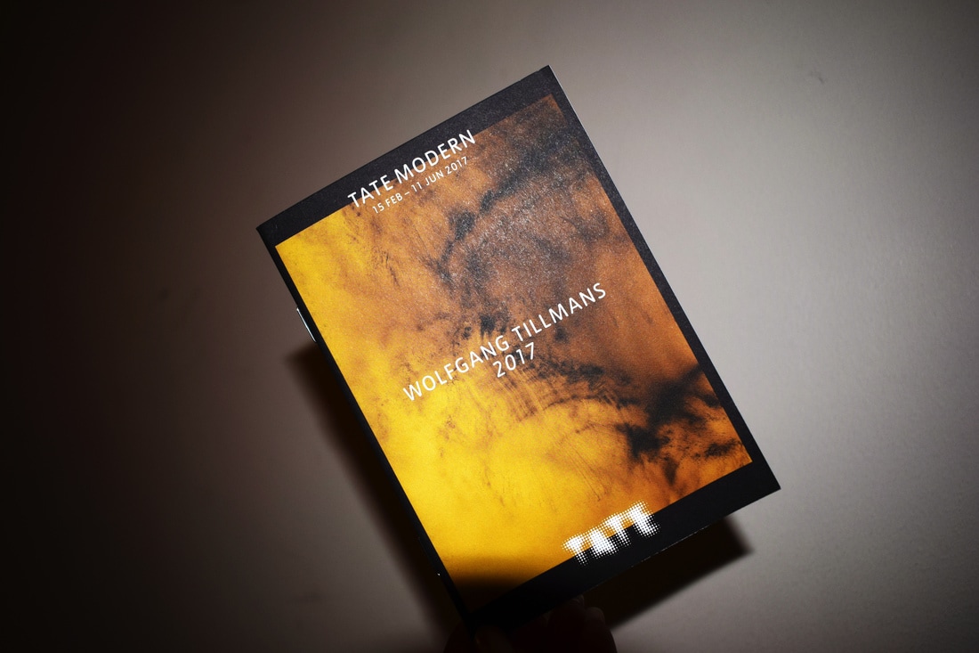
Radical eye exhibition


Myoung Ho Lee
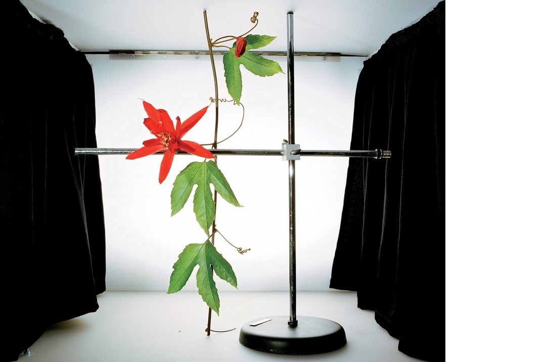
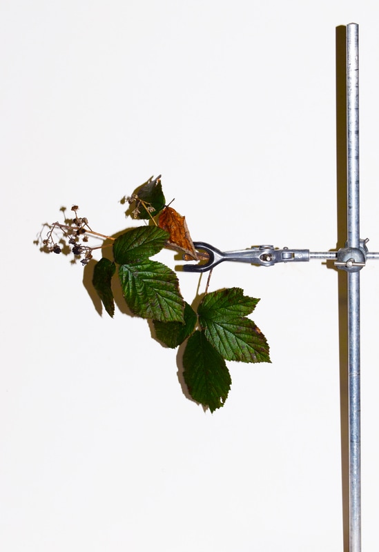
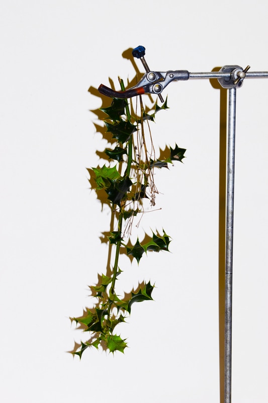
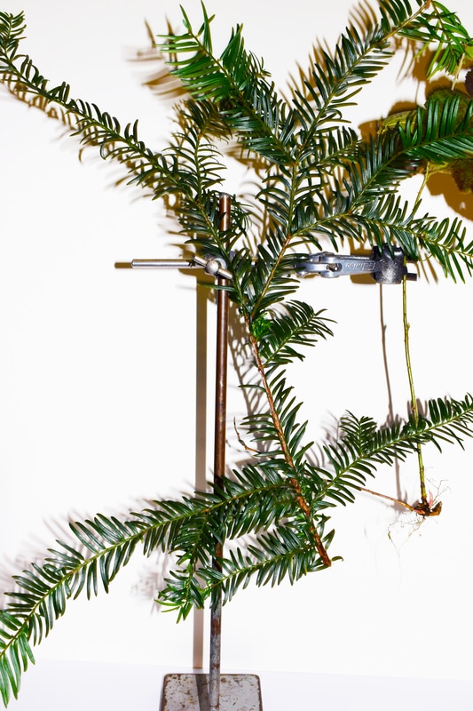
Myoung ho lee was a korean artist interested in separating trees from their surroundings, isolating them so you can appreciate their true beauty. This links to structure because you can see the details of the trees much more clearly like this, and how they've grown differently.

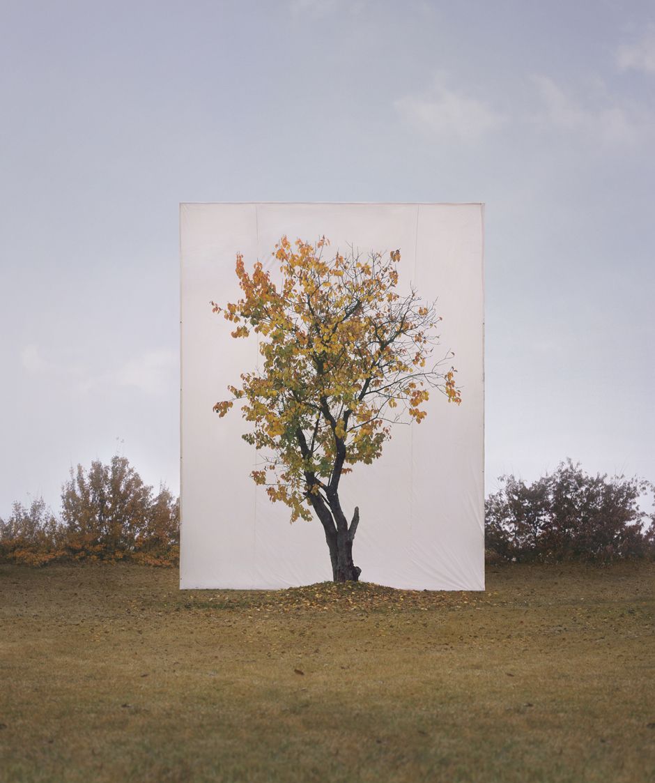
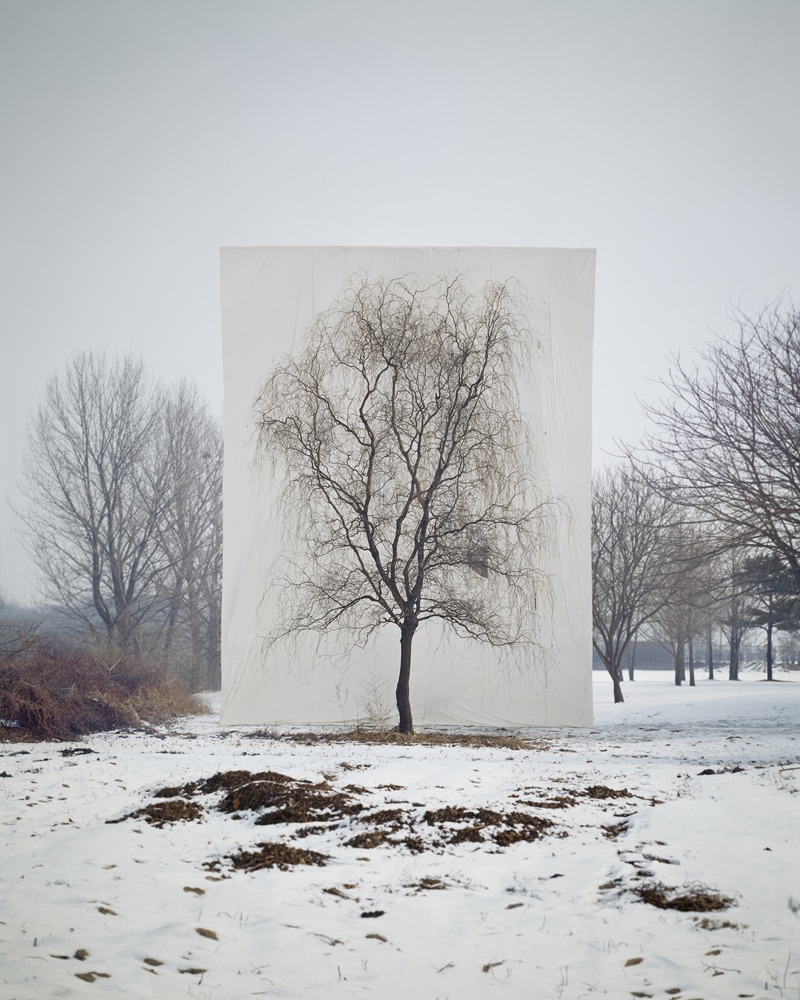
Our task was to do the same, but with plants we found in the woods. (as doing entire trees would be extremely difficult).
My response
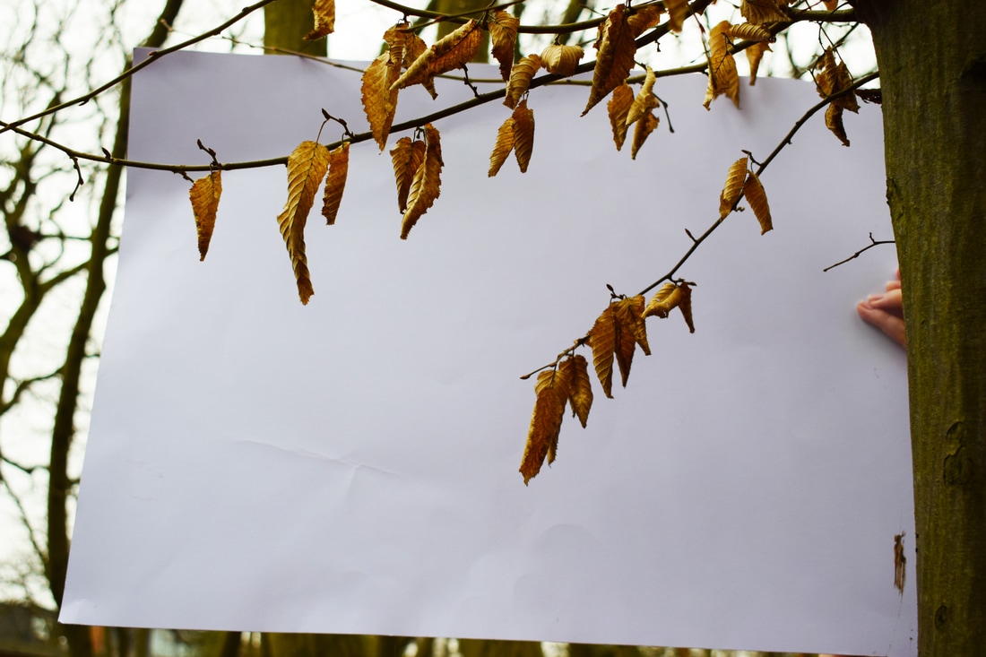


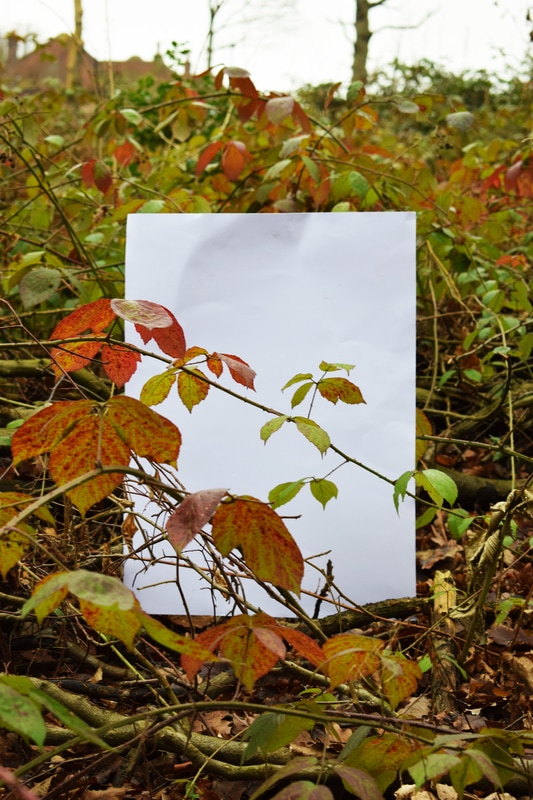
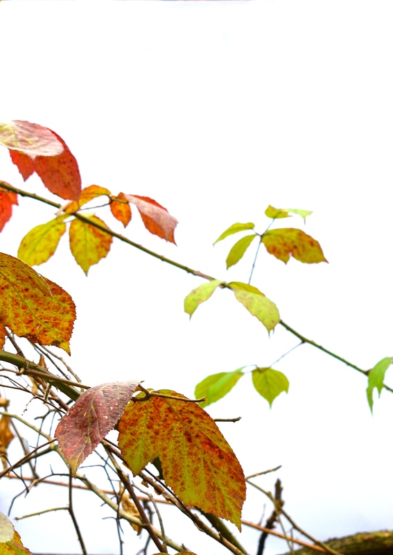
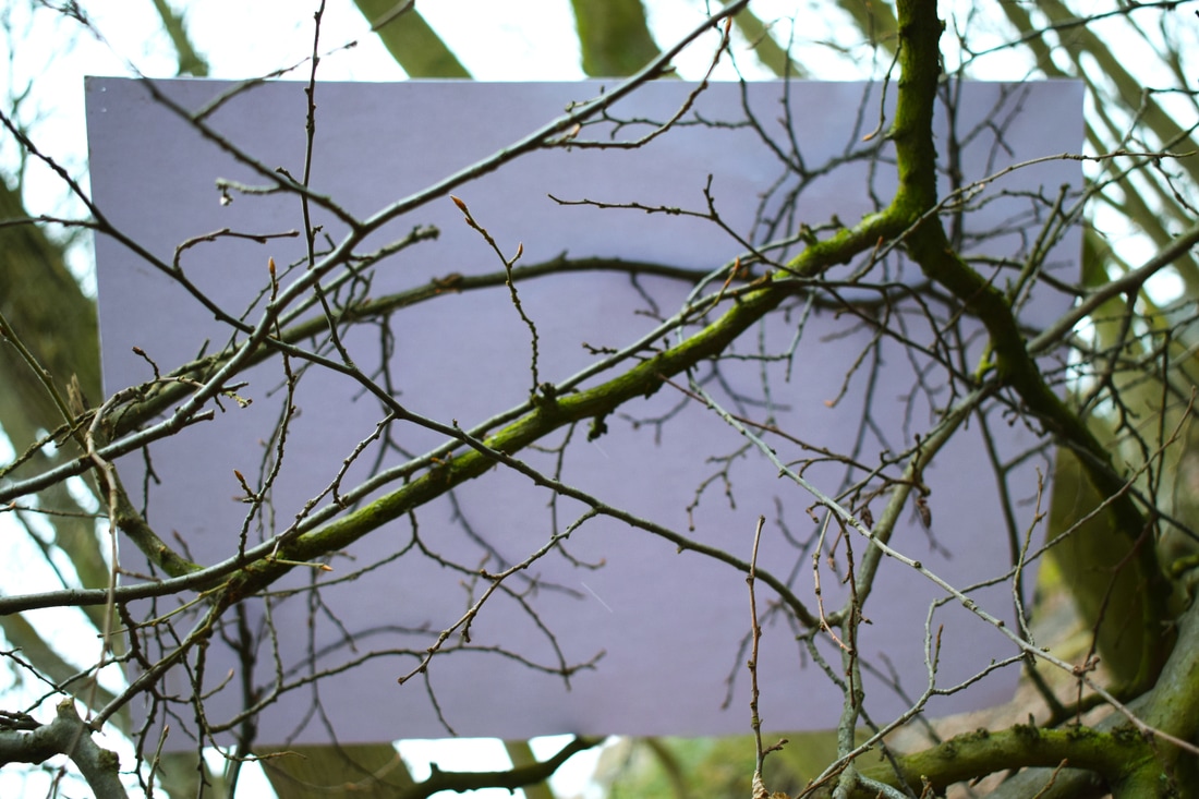
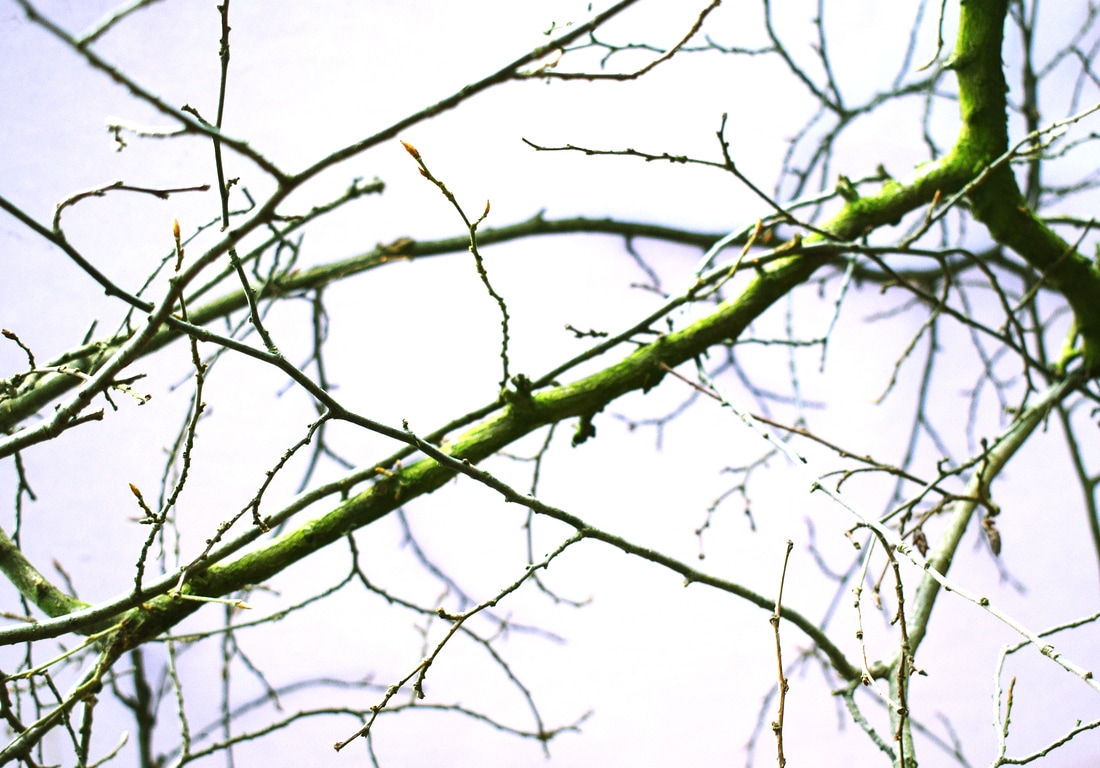
I think I portrayed the effect fairly successfully. However, It would of been better if there was a way to keep the paper upright. It wasn't very solid and often fell over, so we had to hold it in certain places. It was also difficult to find anything interesting to photograph, It being winter and being a forrest mostly containing large trees and dead leaves. Some of the images were taken with flash, and although this made it more crisp, It cast a shadow on the paper and I wasn't sure what I preferred. It was also difficult to edit the paper to be completely white without over-exposing the plants.
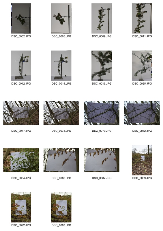
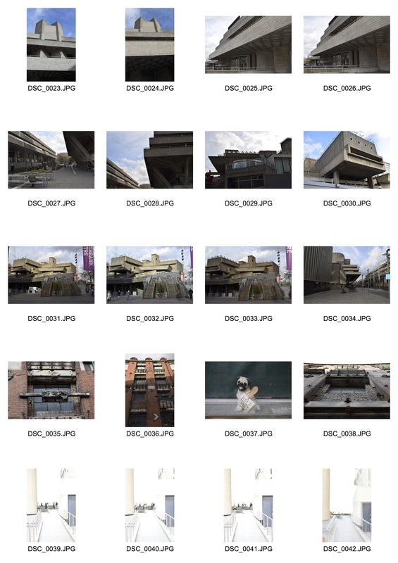
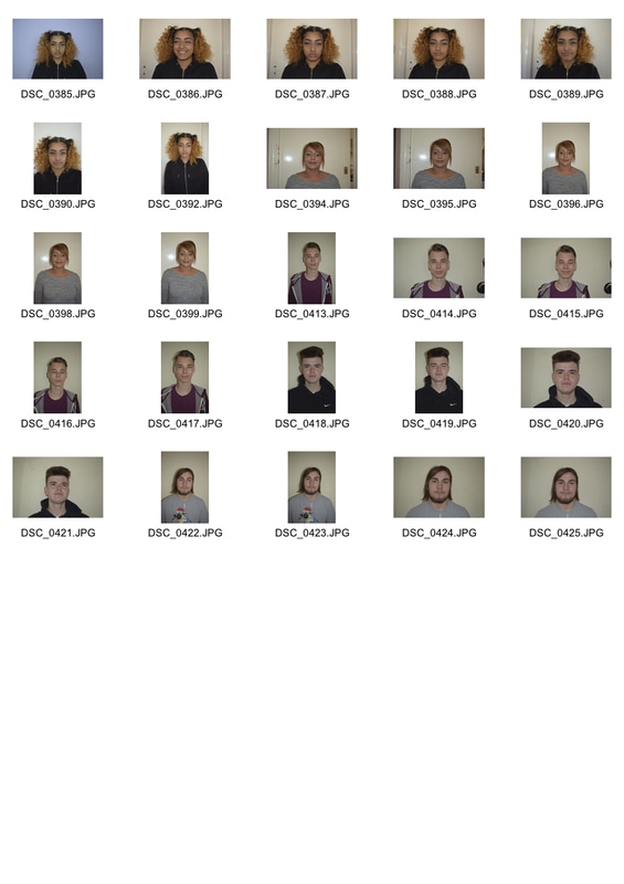
Contact sheet
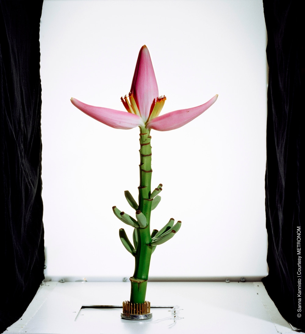
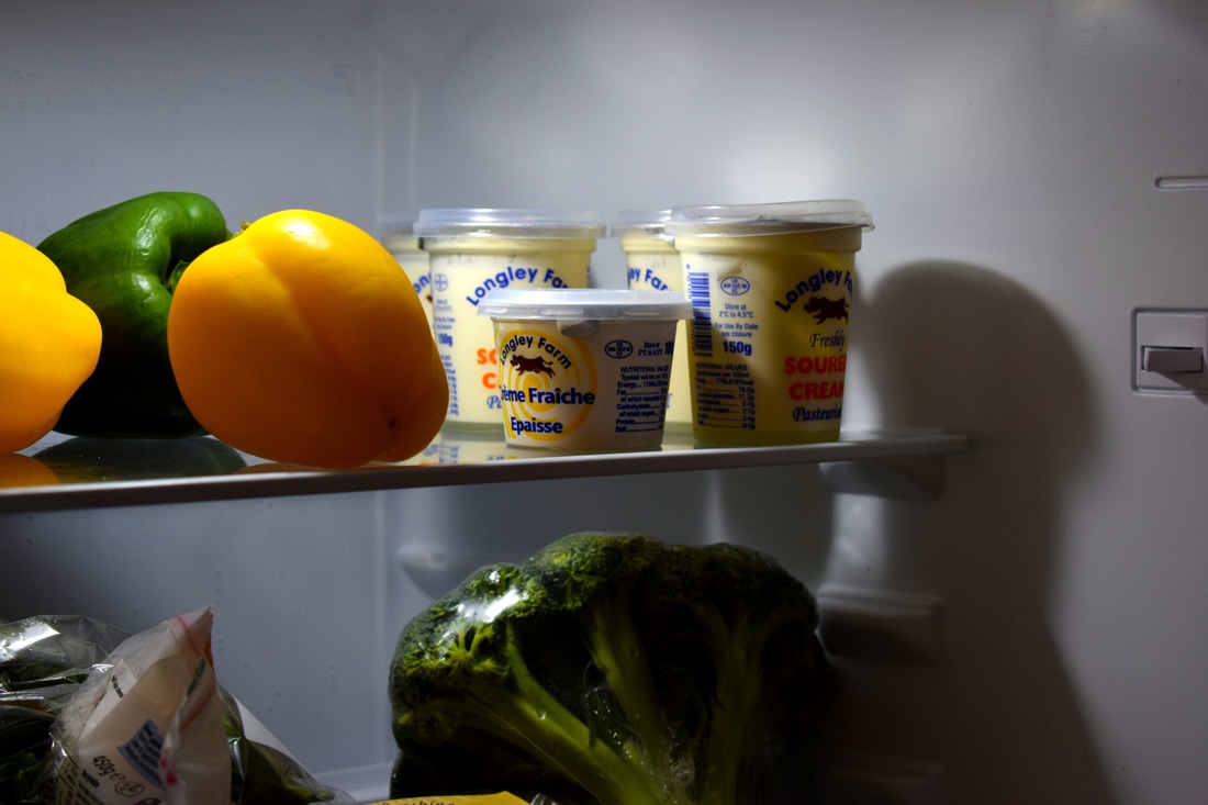
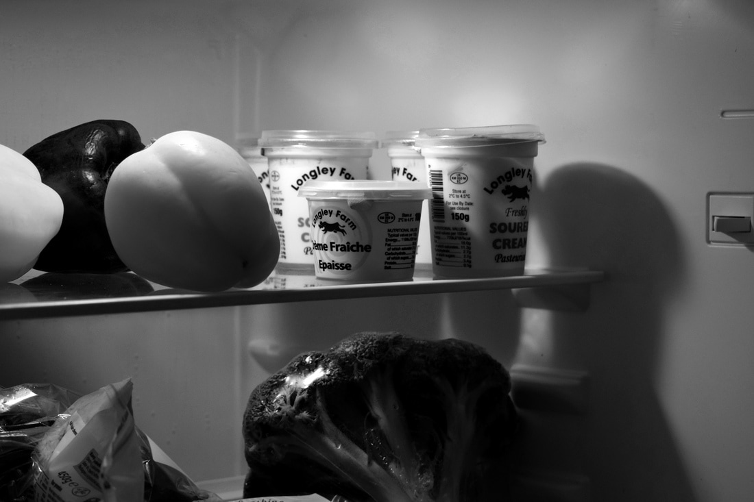
Sanna Kannisto
Kannisto studies plants and animals during her travels to various countries, often South American, where the flora and fauna is vast. She combines art and science to create something meaningful and blur the lines between the two subjects.

My response

I couldn't get a clear image without flash, as the lighting and positioning in the room wasn't ideal. To get good lighting without ruining the quality by using a high ISO, I used a large aperture but a longer shutter sped, but this resulted in some blurry images, so I didn't use them.
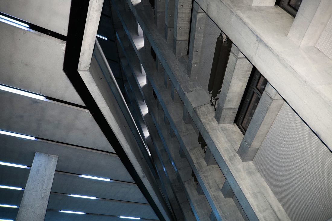
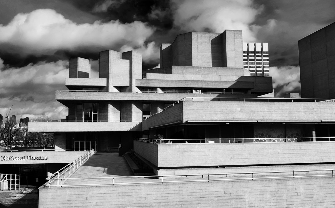
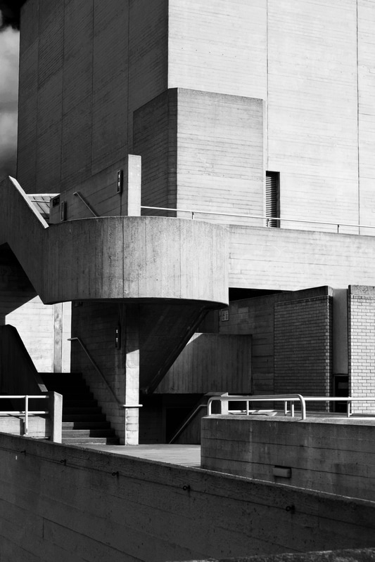
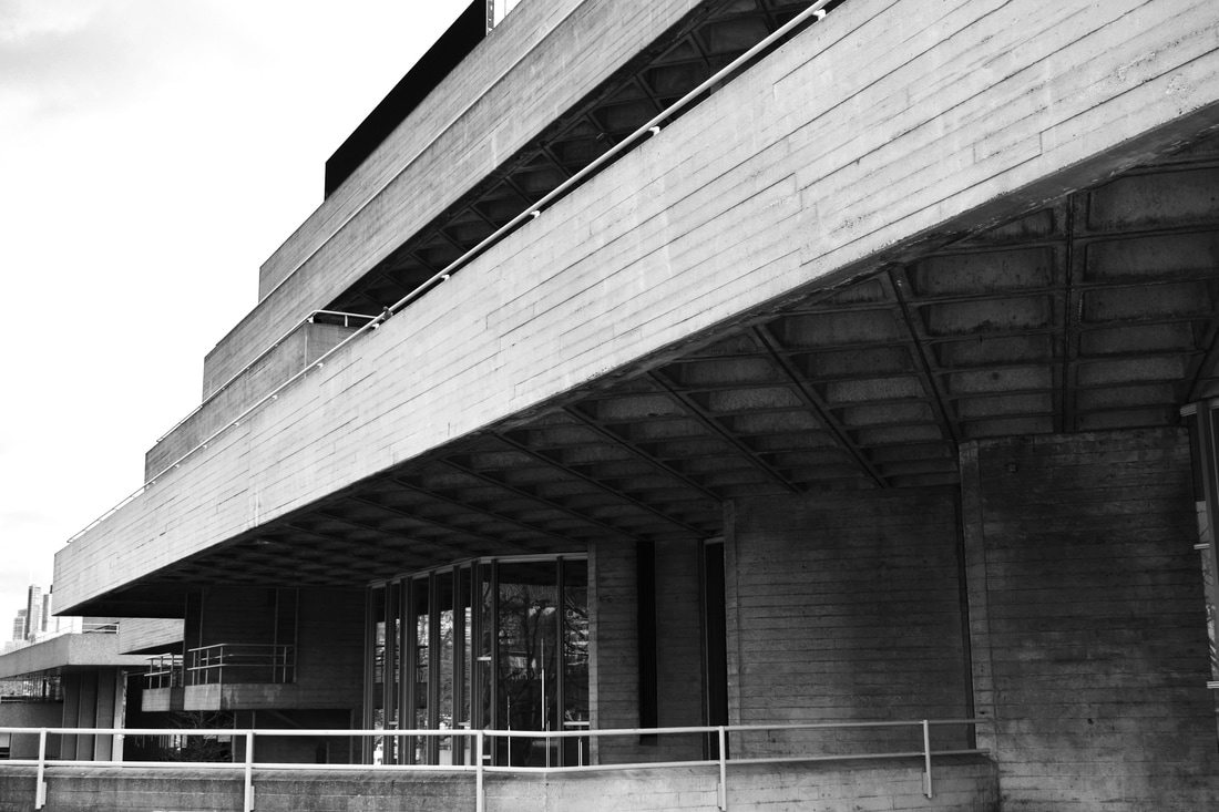
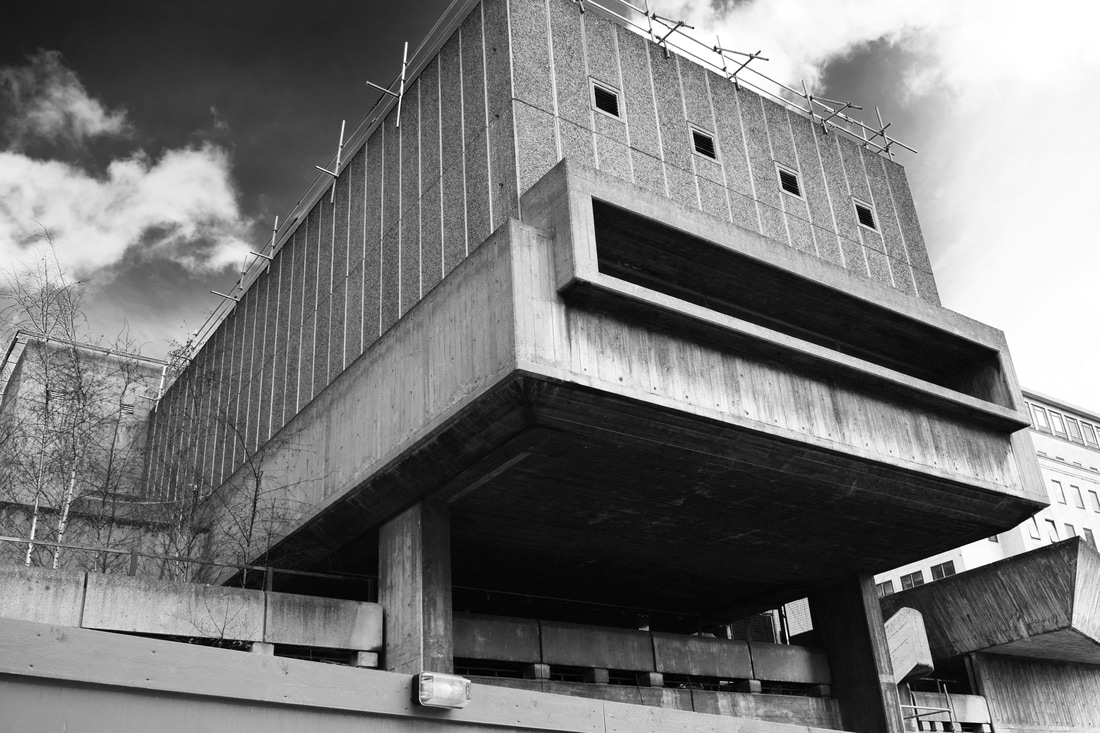
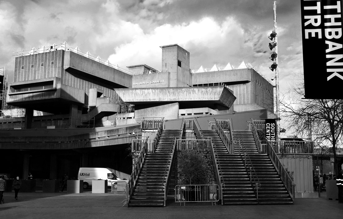
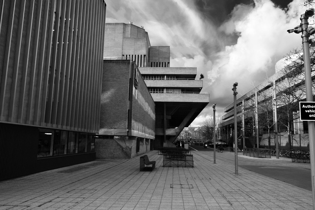
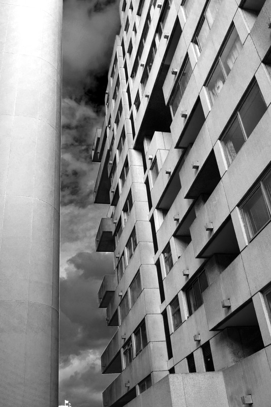
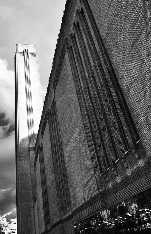
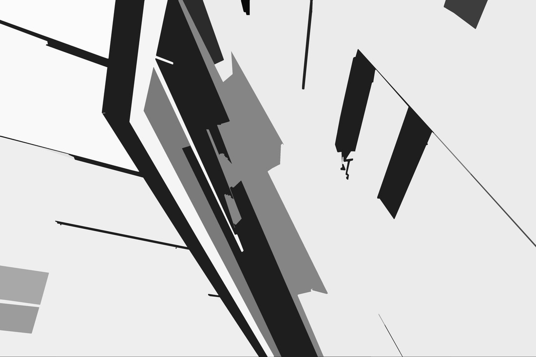
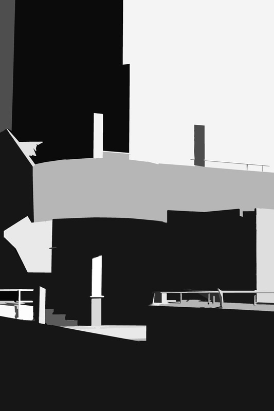
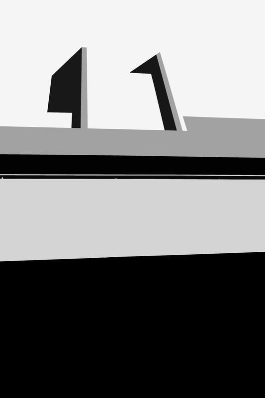
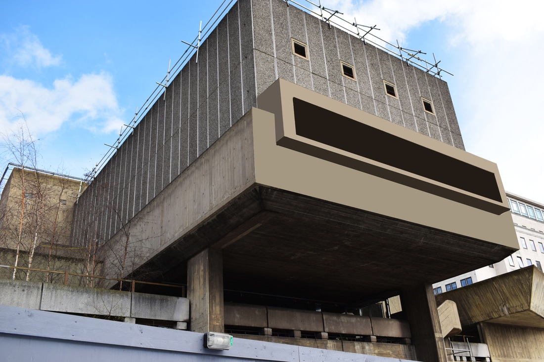
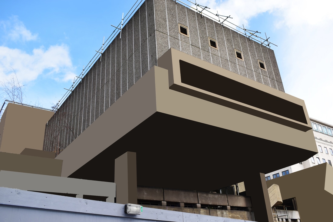
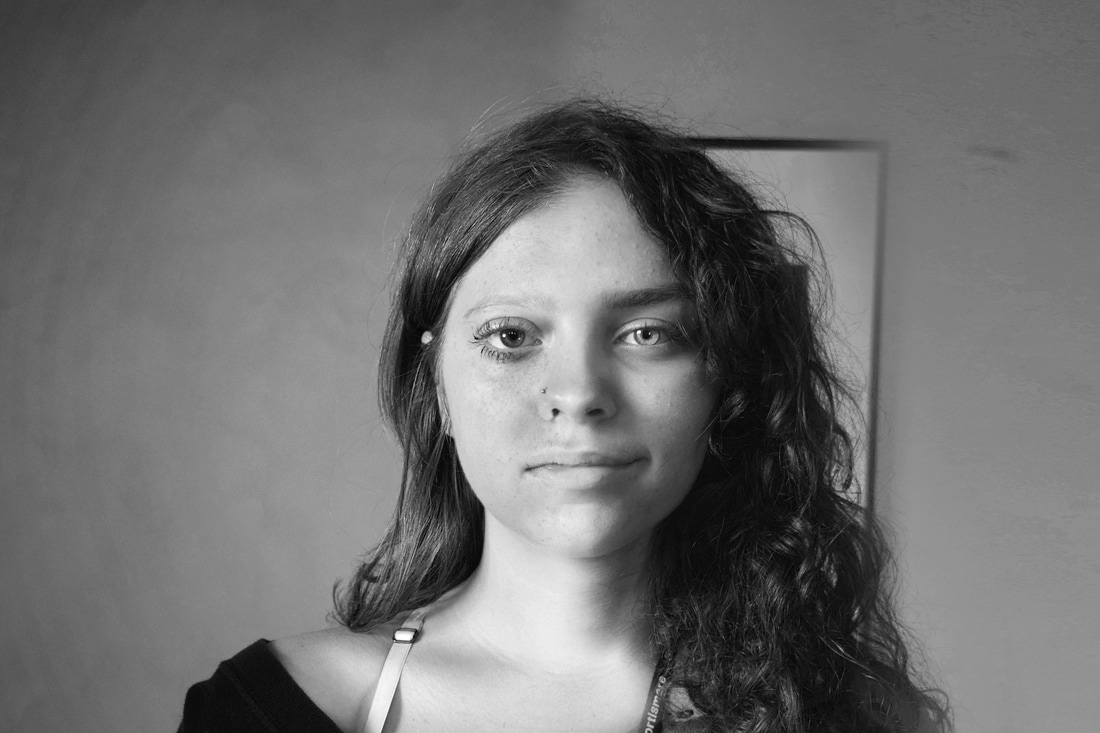
Simon Phipps
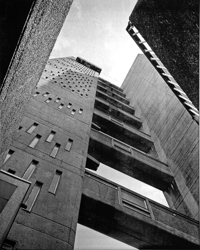

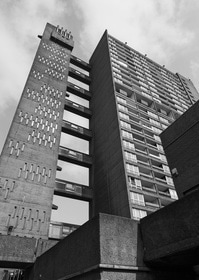
Phipps takes stark, black and white pictures of brutalist buildings. They are often taken in a way towering over you, intimidating you, enhancing the vastness of the building. He edits these pictures in a way that enhances their details and intricacies, also making the picture more interesting on the eye.
My response
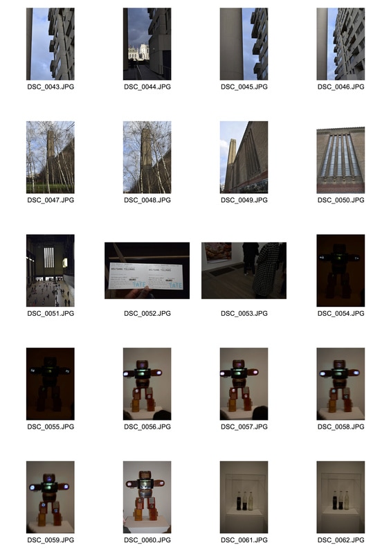
Contact sheets

Galleries


Edits


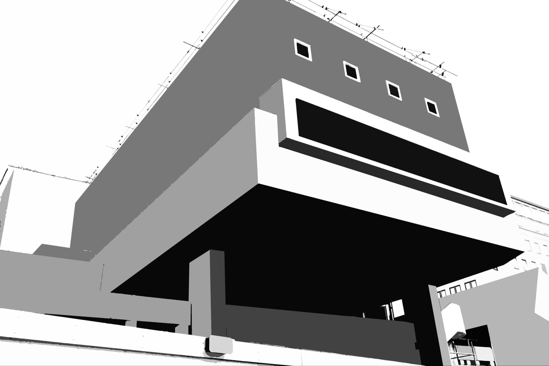
Process
The texture was too complicated to use the cutout tool filter straight away, so I used the polygonal lasso tool to select the angular areas, then used the average filter to get the average colour of the selection.
Once I'd done all the areas, I put it in black and white and used the cutout filter. I had to do this with all of my images (except the colour one) because the texture was complicated and didn't make a clean image.
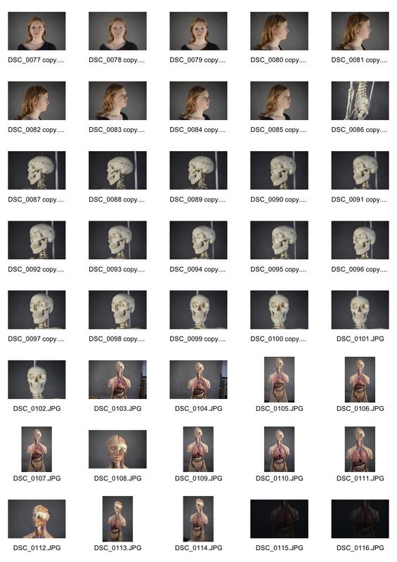
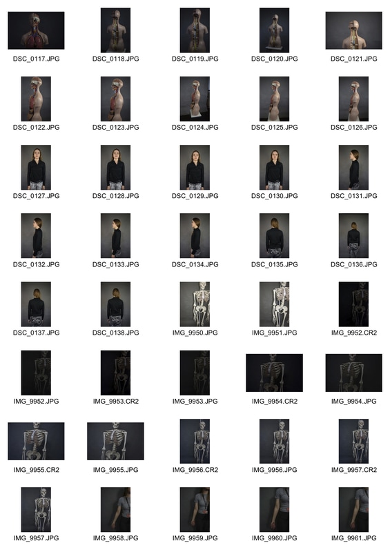
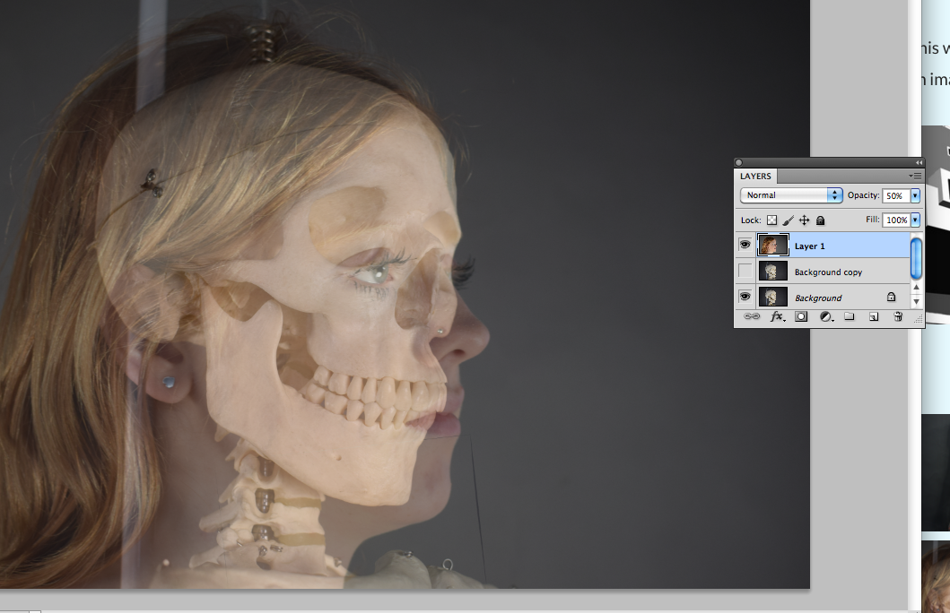
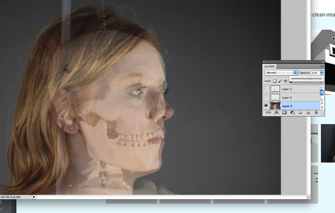
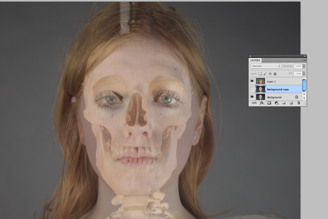
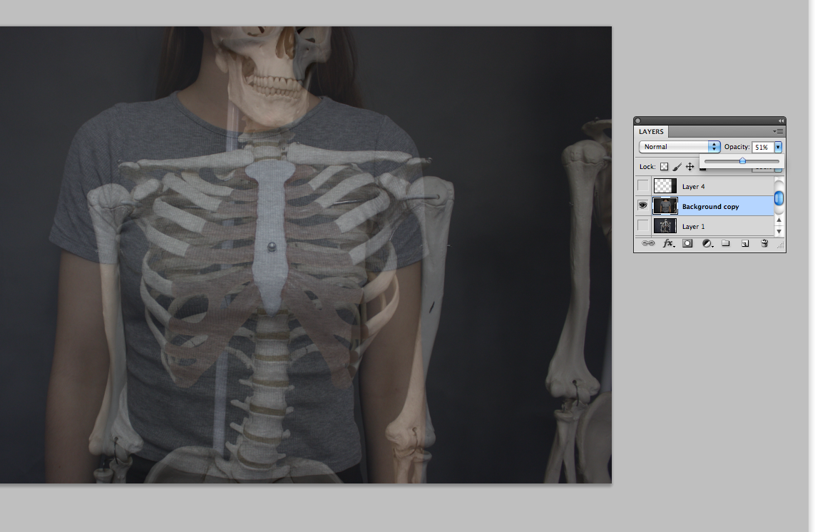
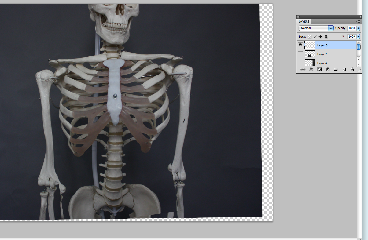
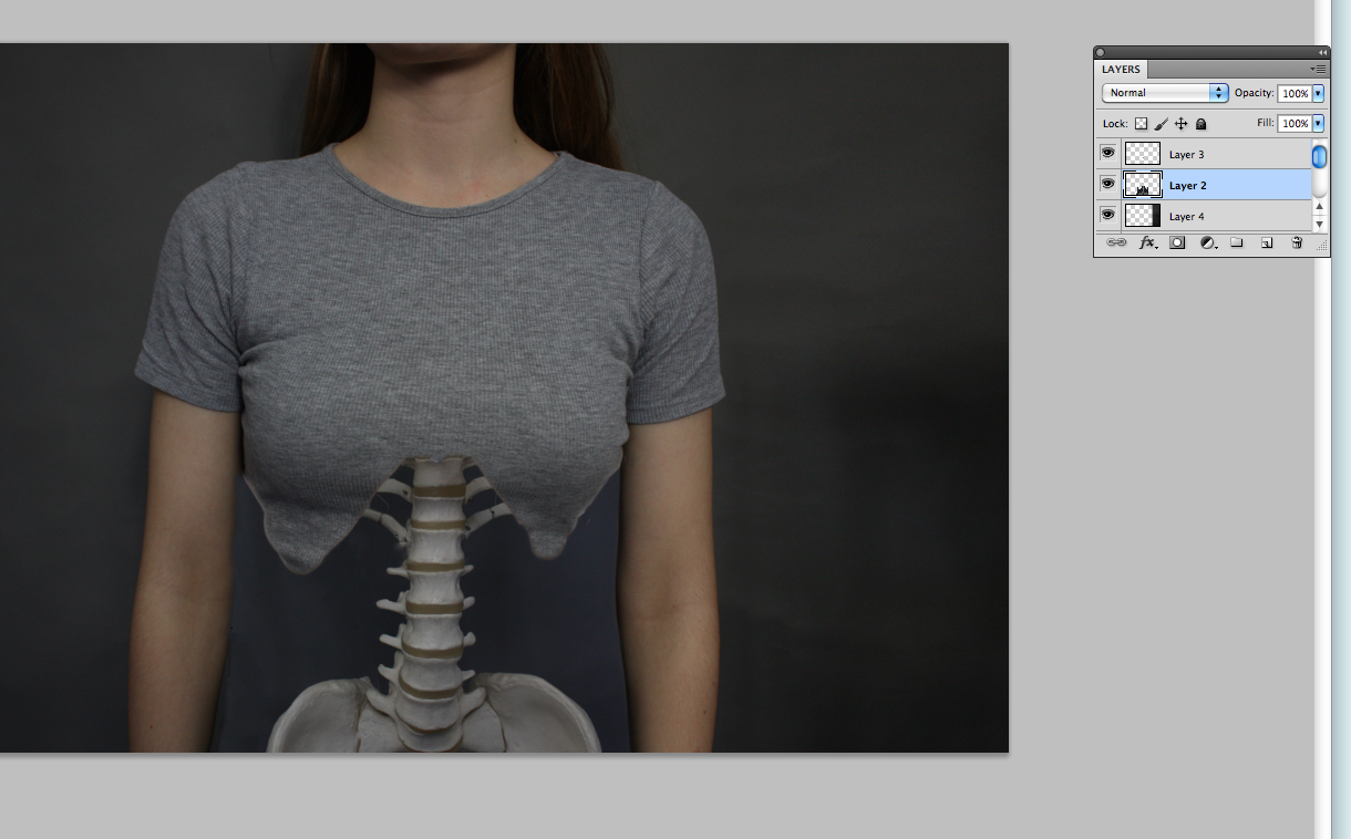
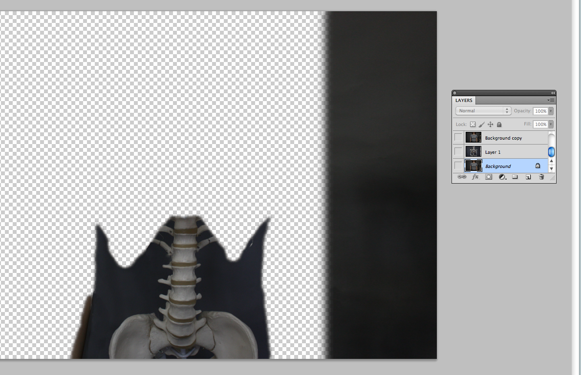
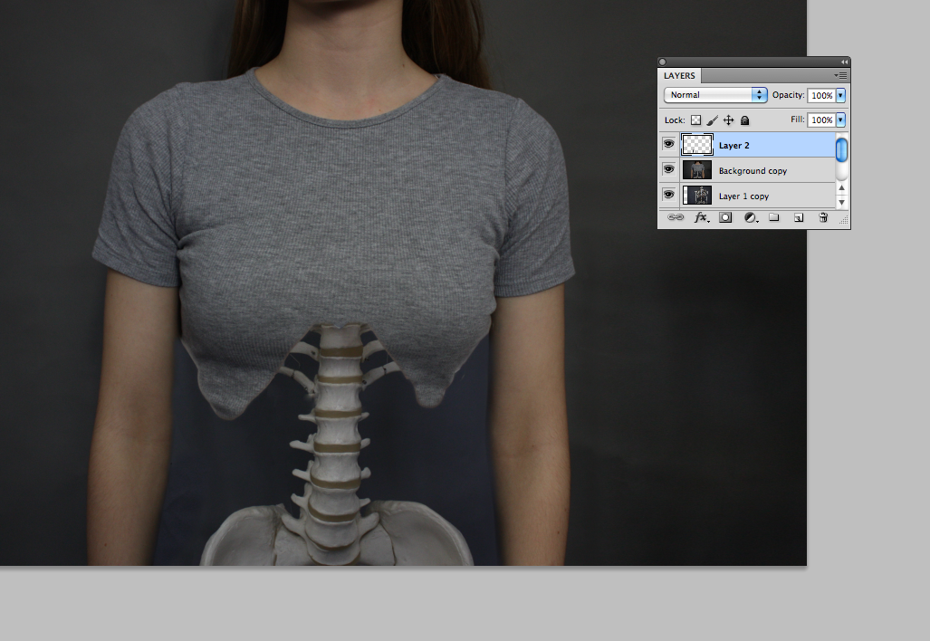
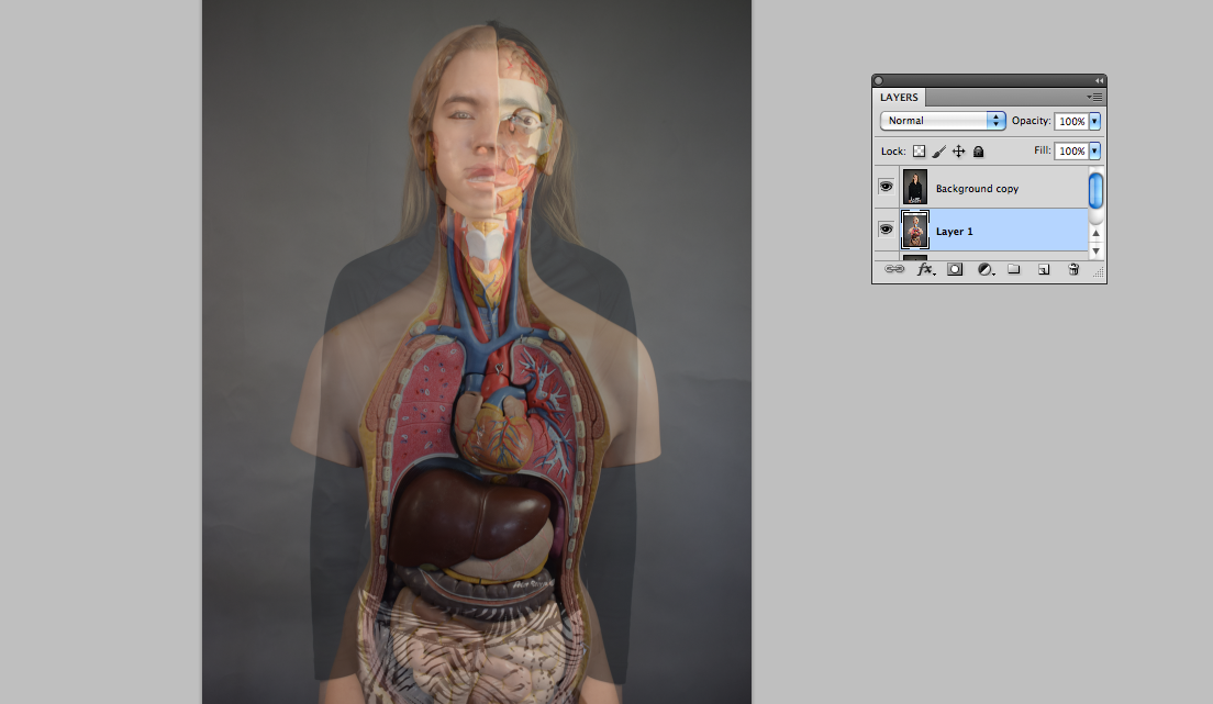
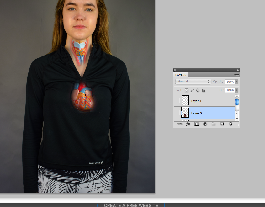
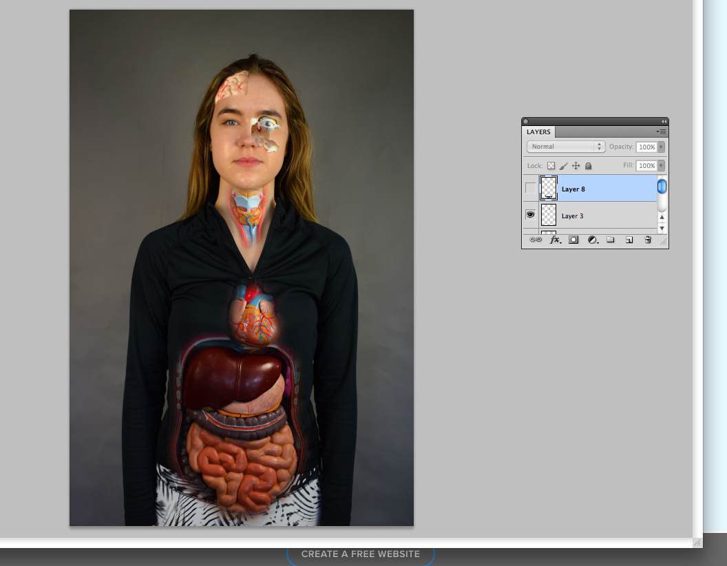
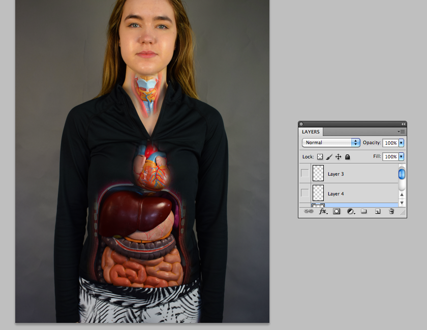
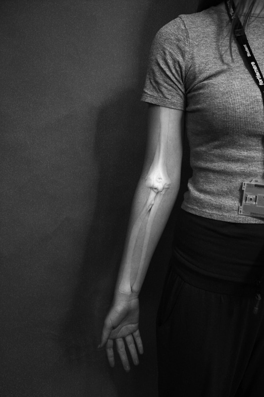
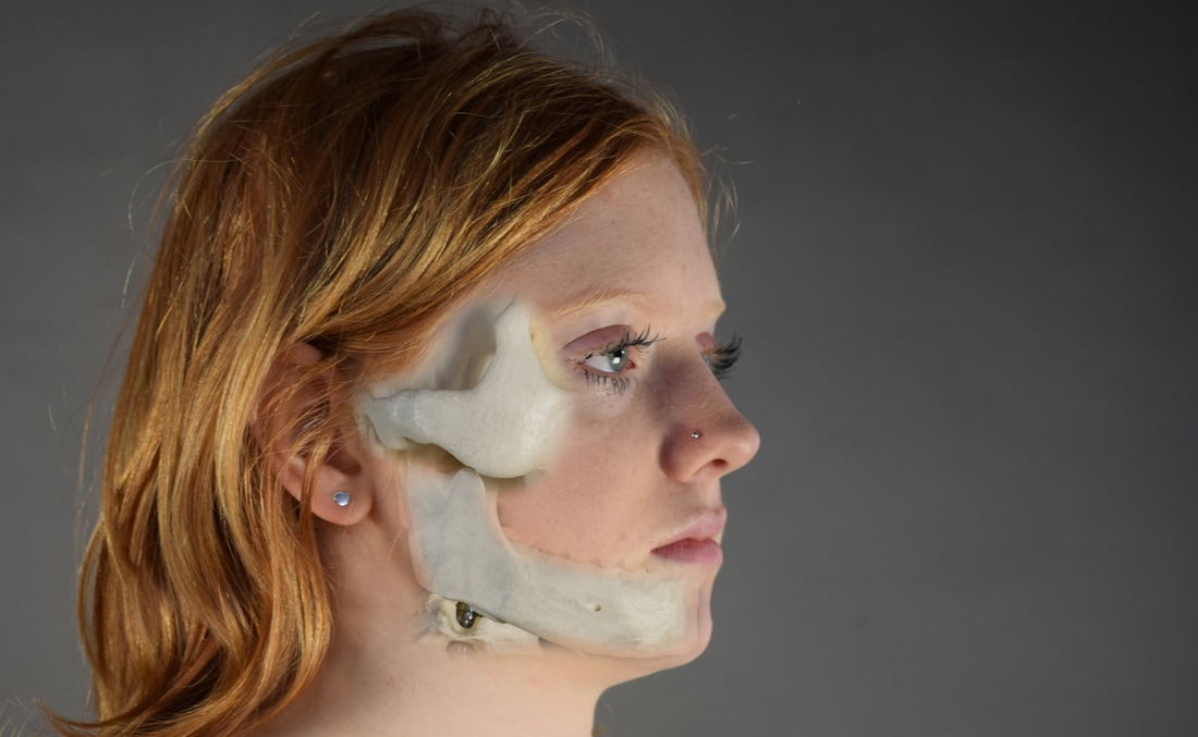
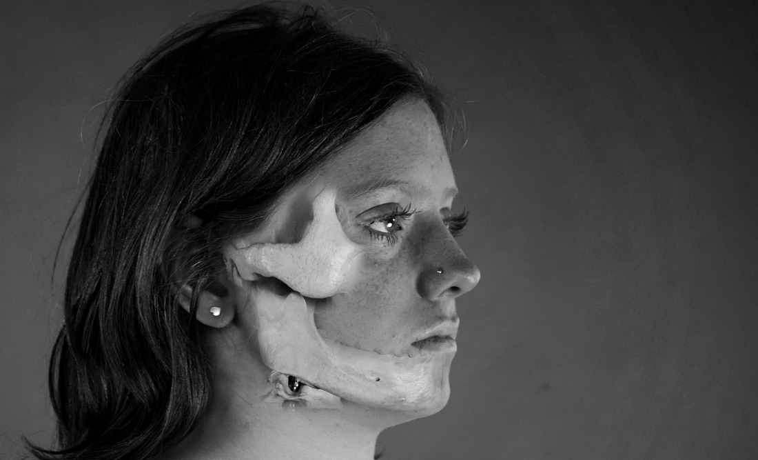
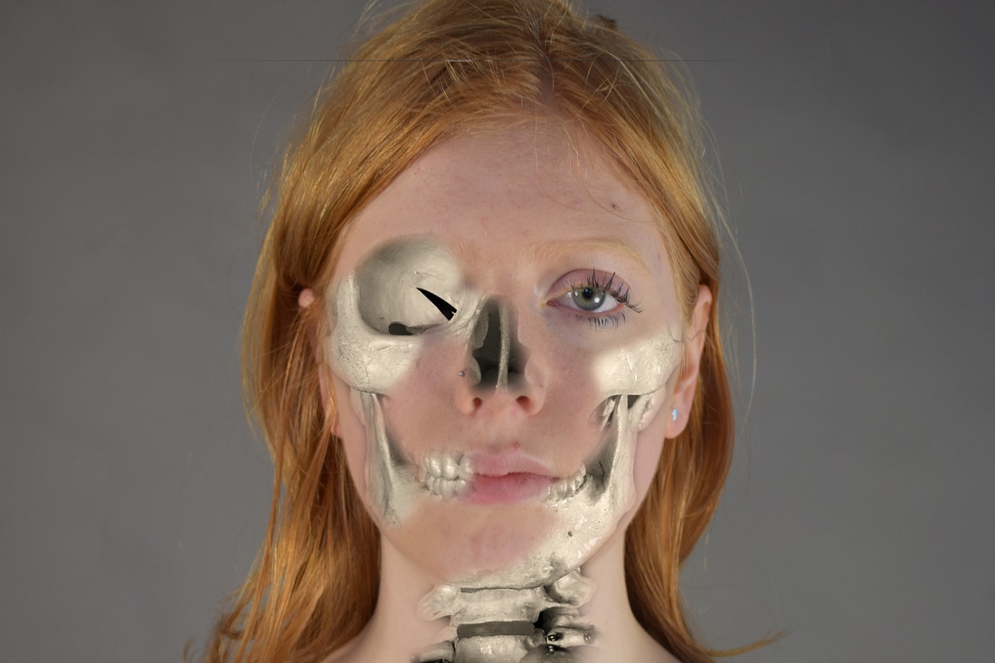
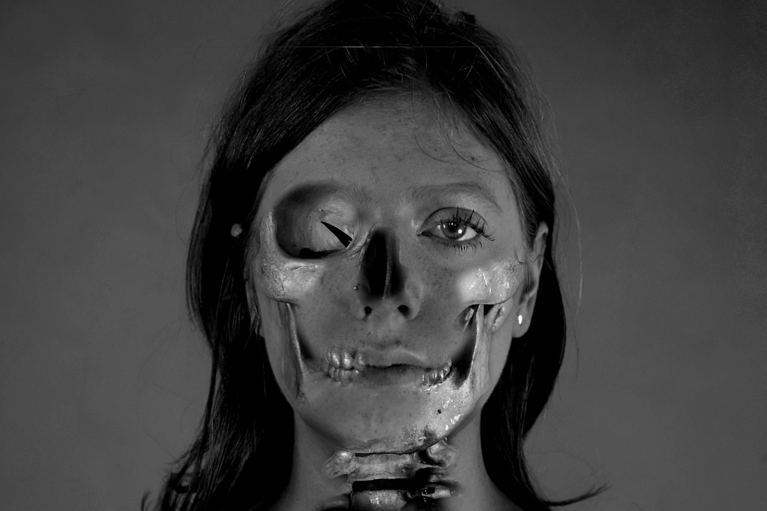
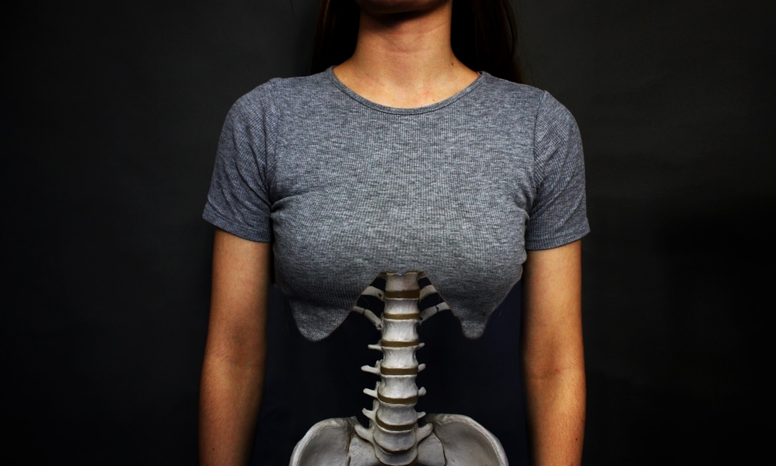
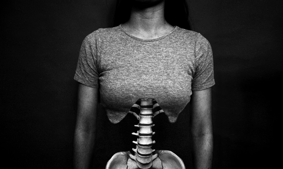
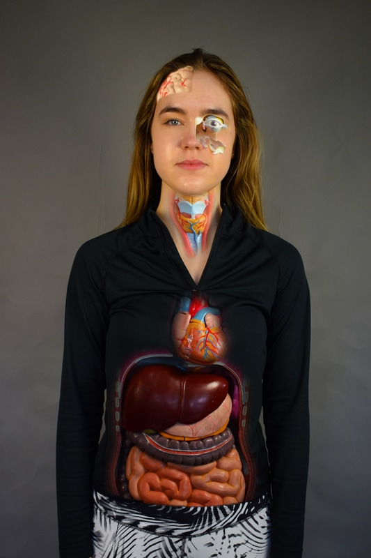
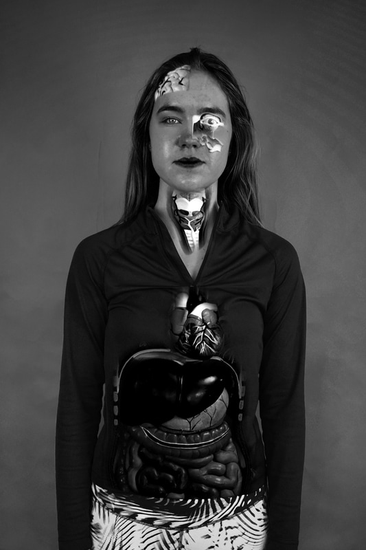
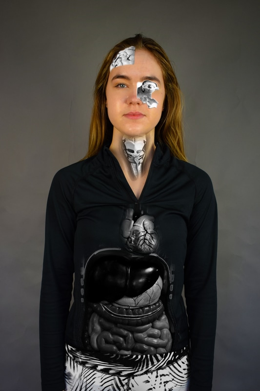
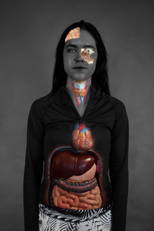
Structure in the body
Contact sheets
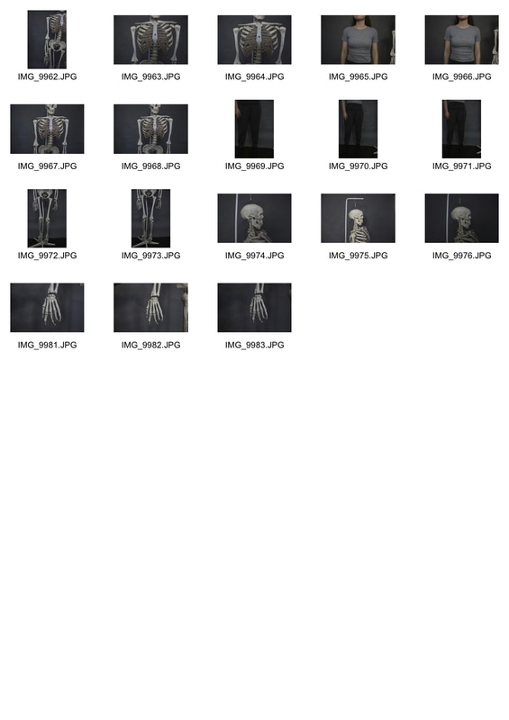
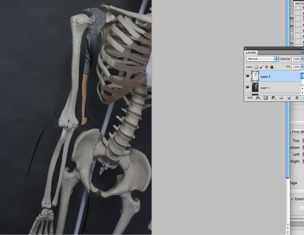
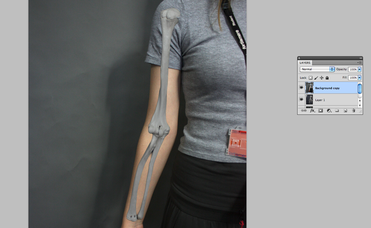
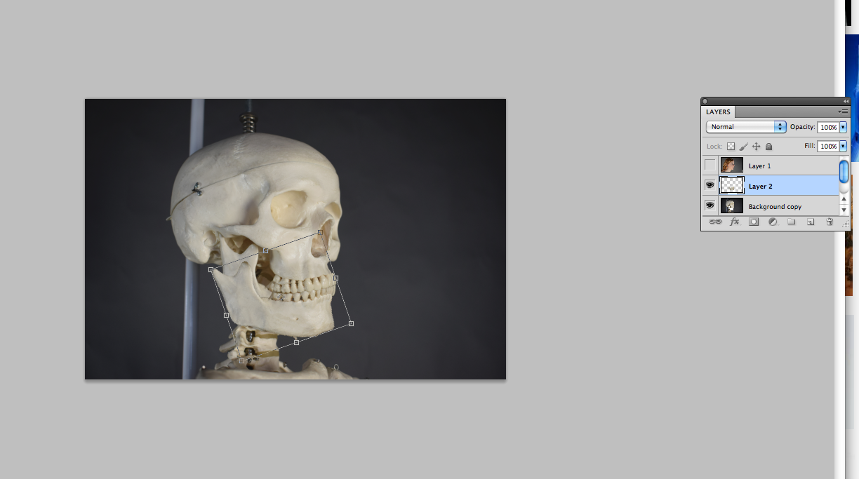
Process screenshots


Edits

Refining
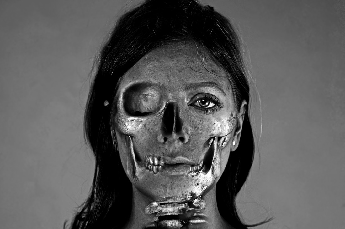
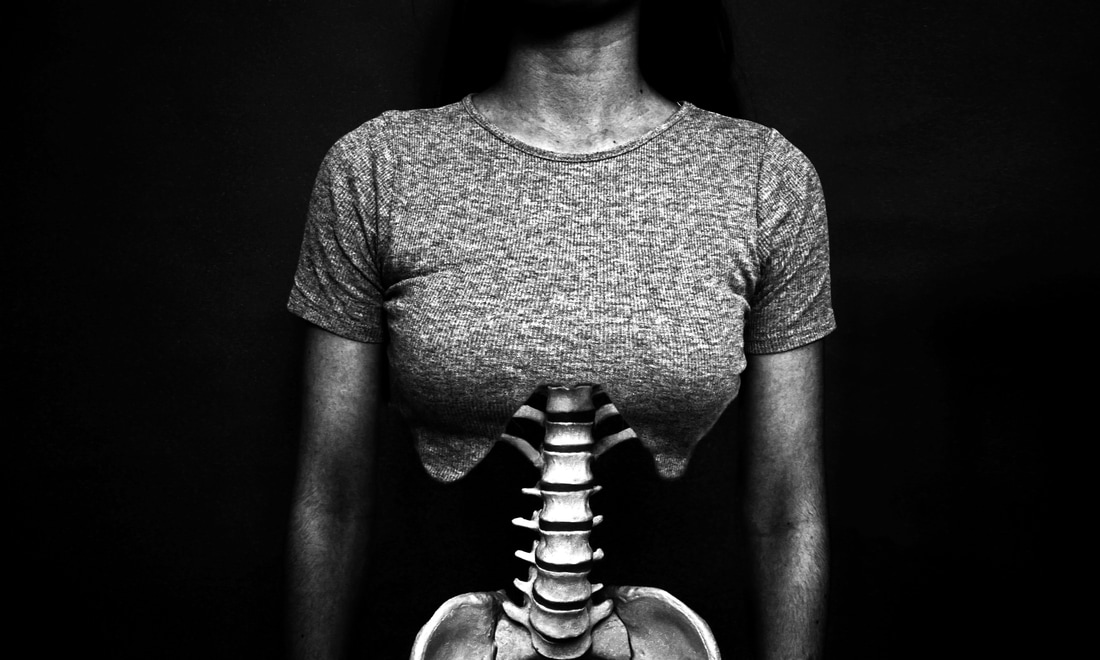
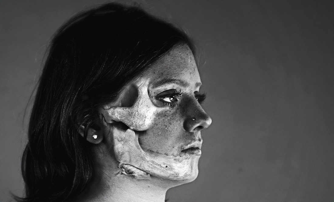
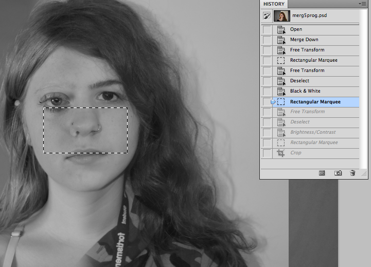
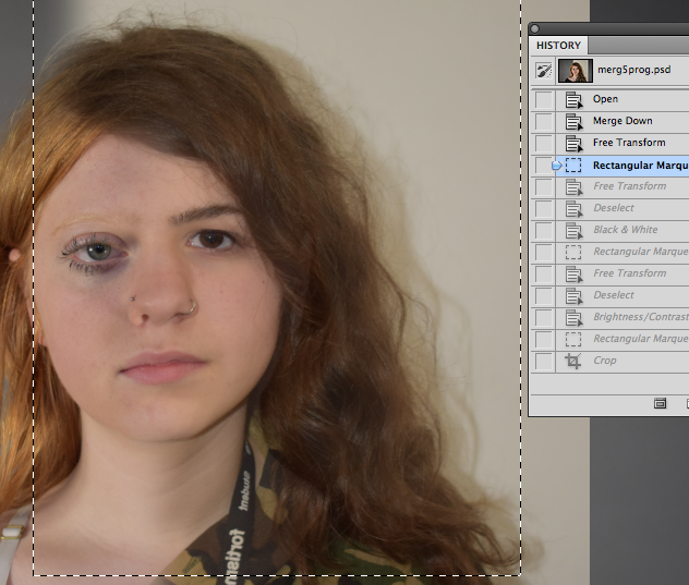
Although it was difficult, the skeleton edits were the most successful. The skeleton was never in proportion to the person and it was difficult to make the bodies line up without it being very obviously warped and edited. They looked a lot better in black and white because sometimes the colour or shadows would look odd. The skeleton - being not real - had a lot of pins/strings/bolts holding it together which occasionally ruined the image which I had to edit out. I think the organ edits were the least successful because the model had a very plastic and artificial feel. They also was not in proportion or positioning to a real human body, so at first it looked extremely odd.
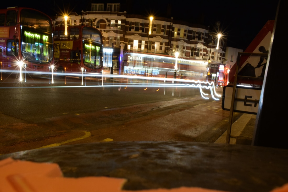
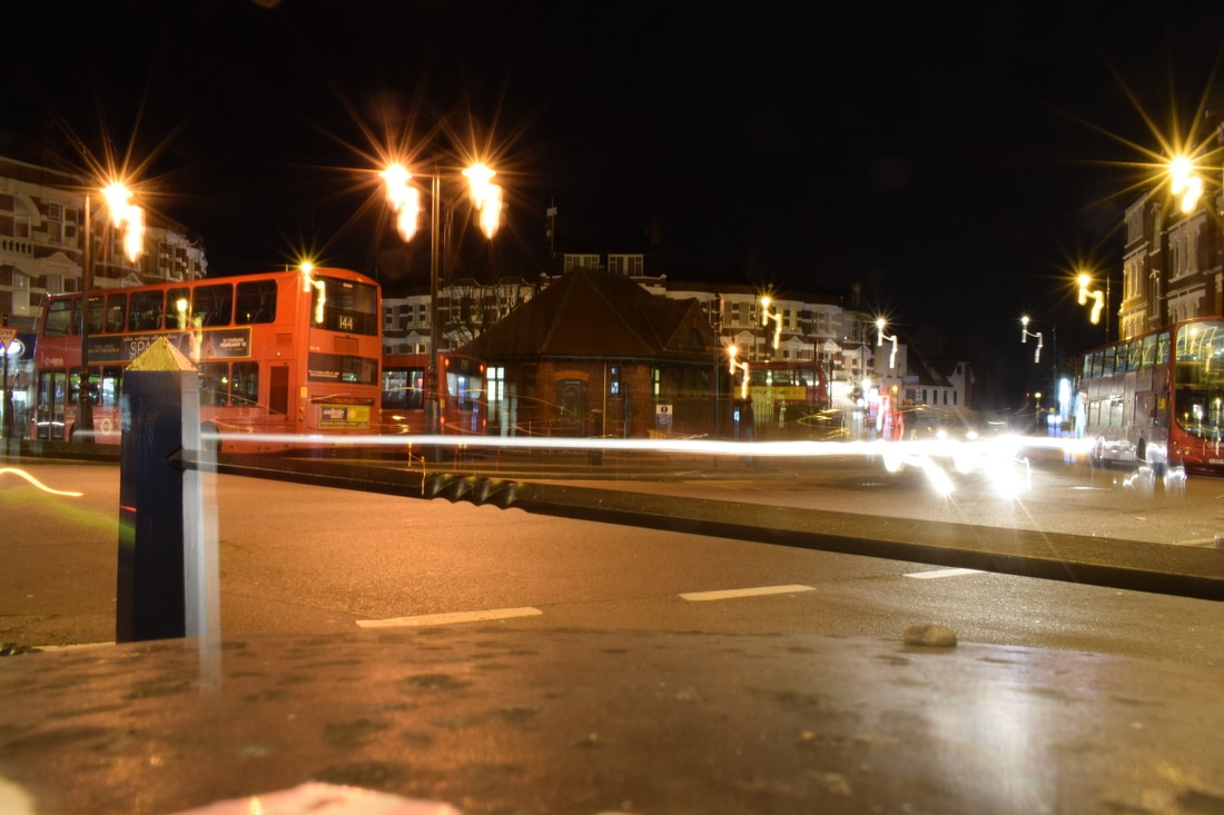
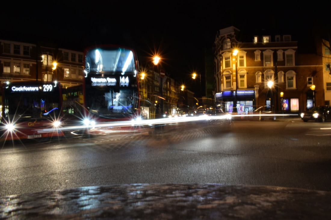
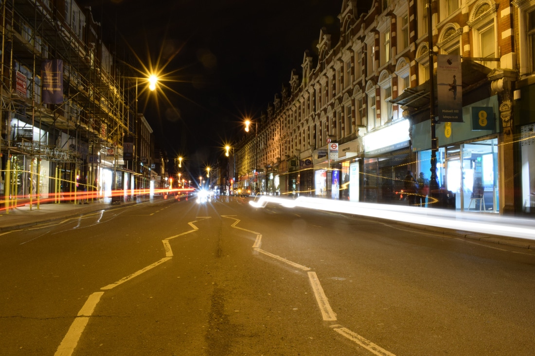
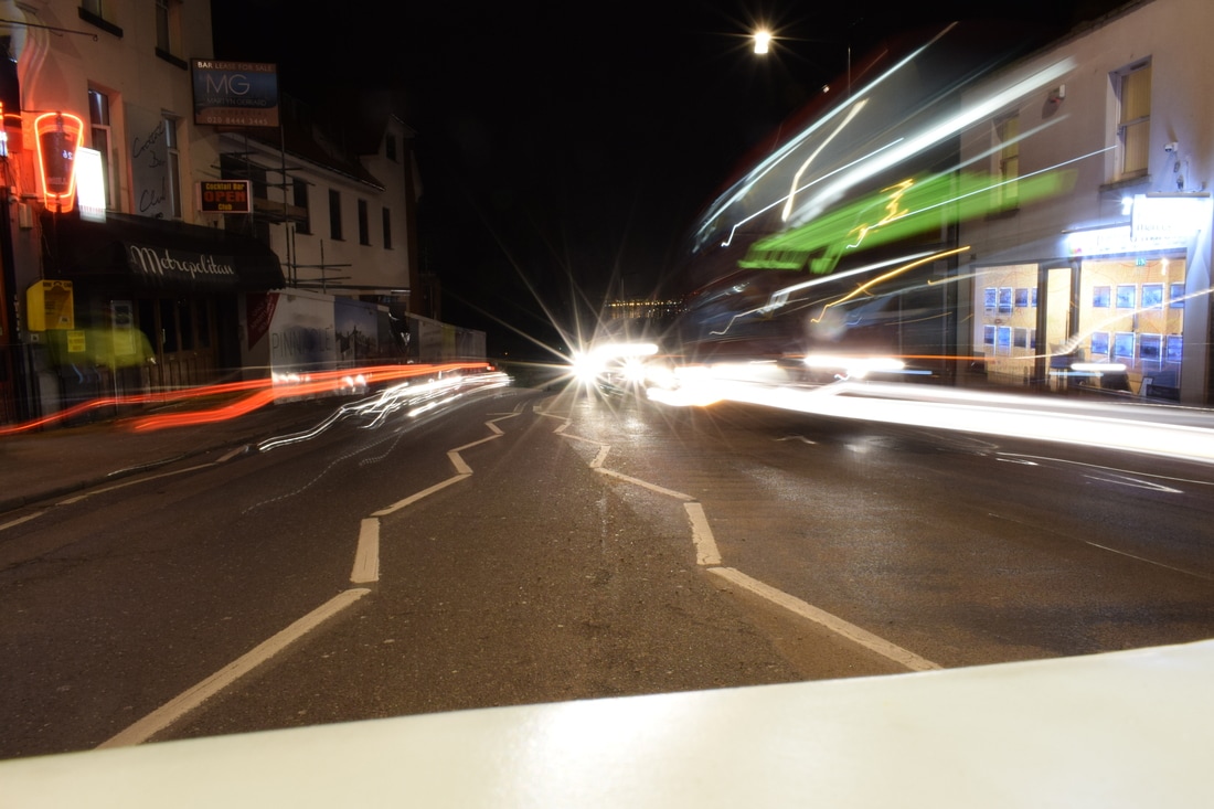
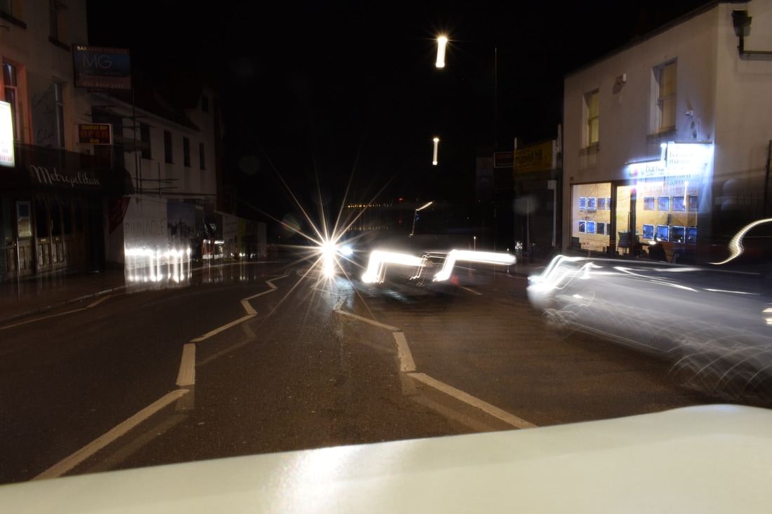
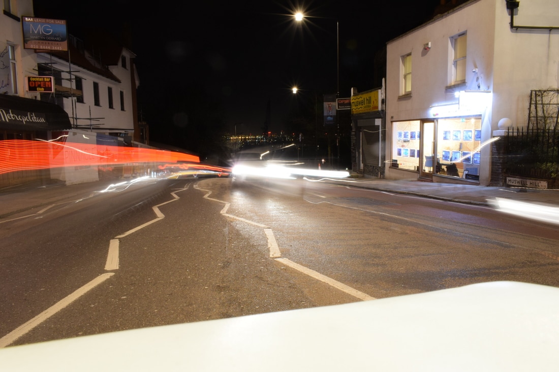
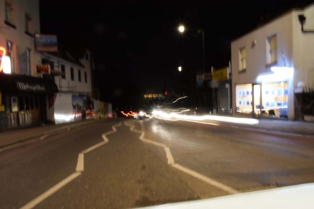
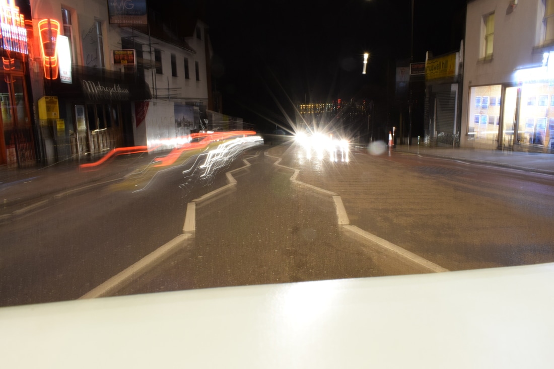
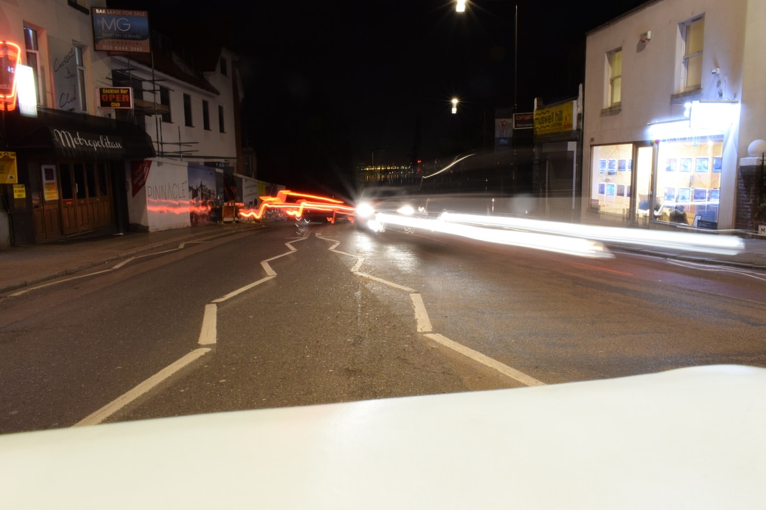
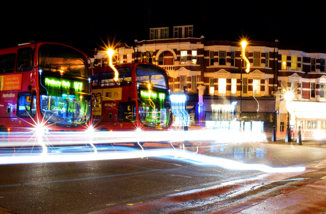
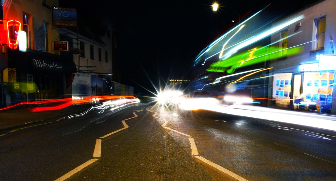
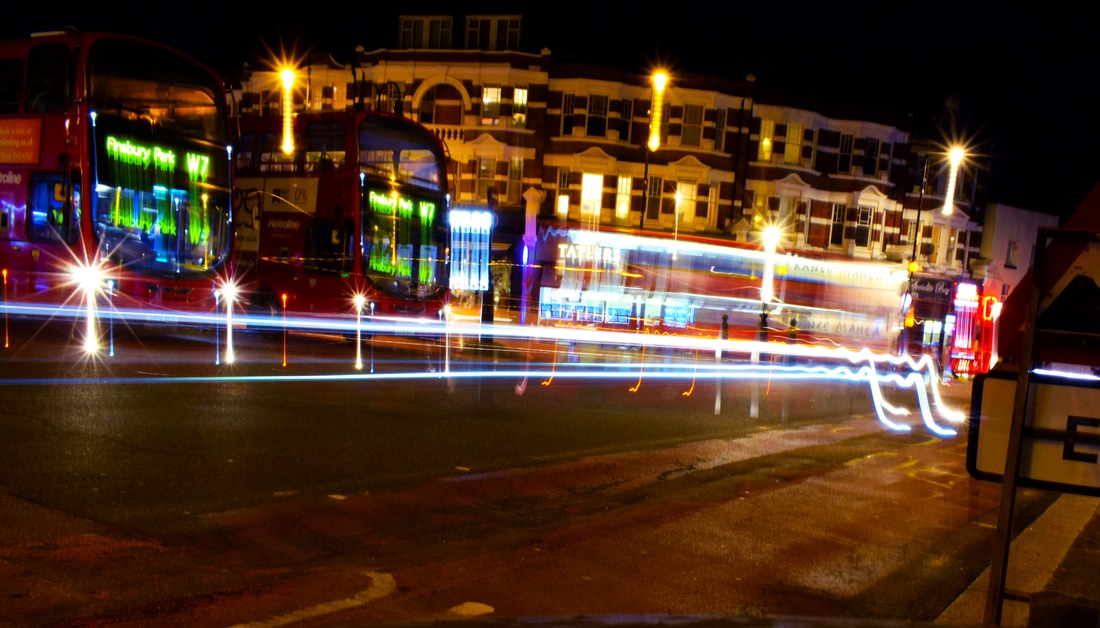
First strand - Long exposure/City structure
Mark Burban
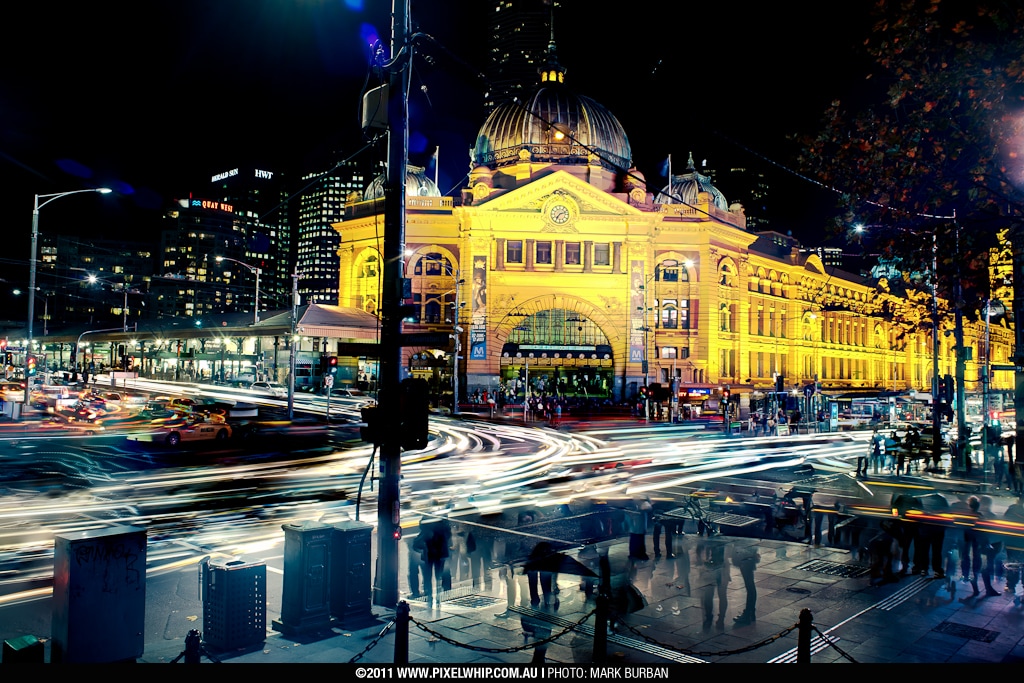
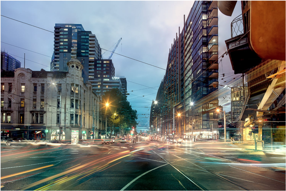
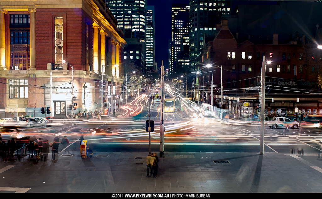
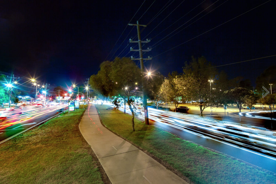
Burban does beautiful long exposures in the city. the combination of colours with the length of the exposure creates a rainbow-like flowing effect which conflicts yet enhances the hard edges of the city.
I took these images in muswell hill with shutter speeds ranging from 1-10 seconds. I didn't have a tripod so I had to rest it on flat surfaces I found.
Experiment 1


Edits

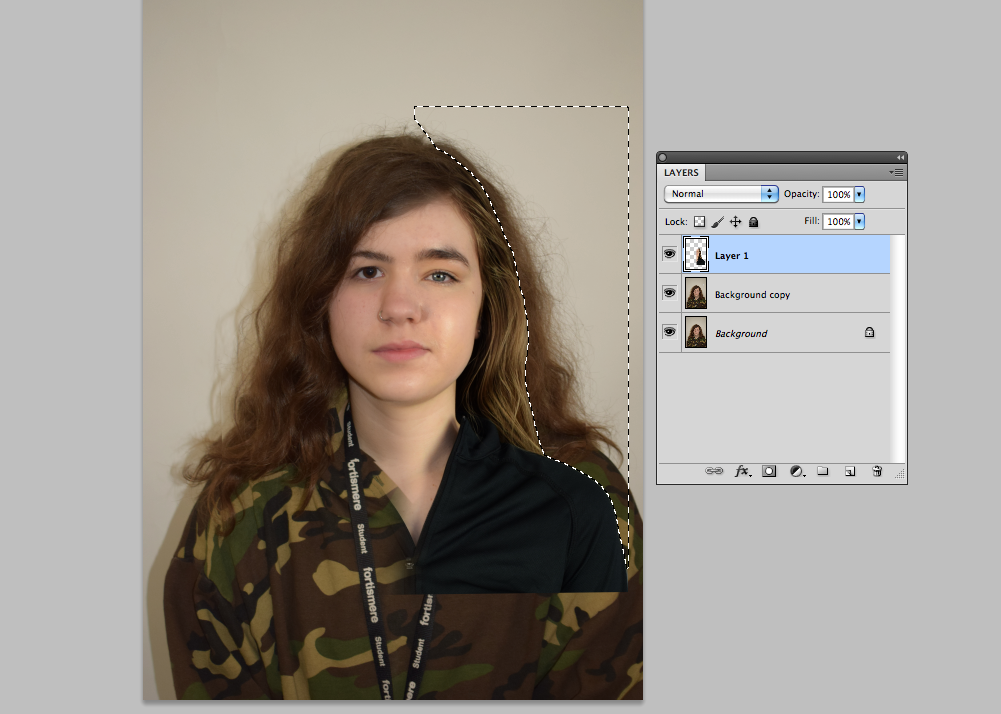
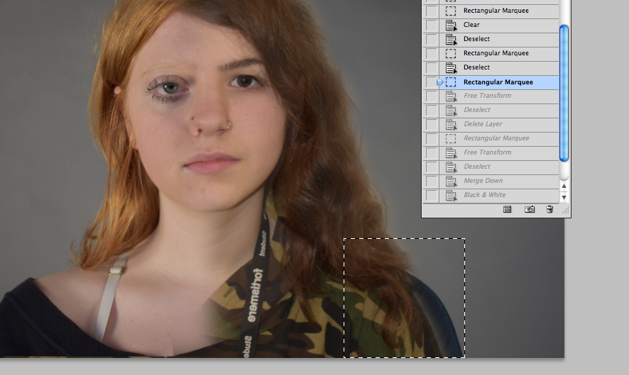
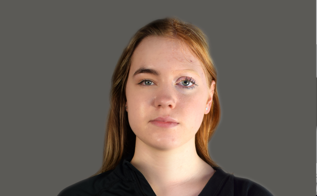
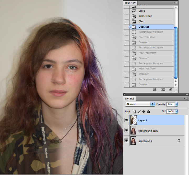
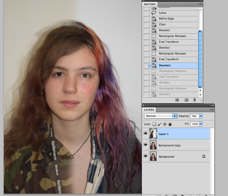
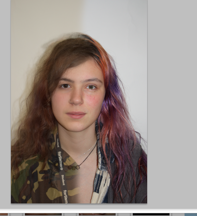
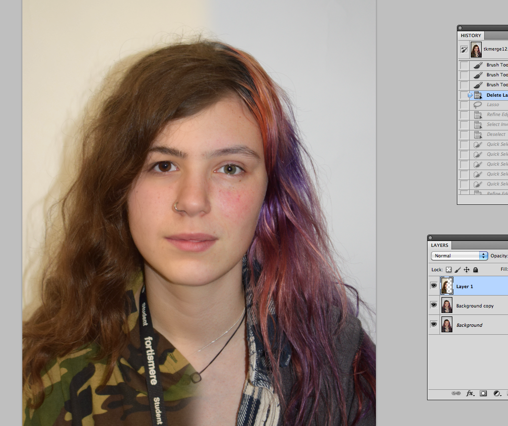
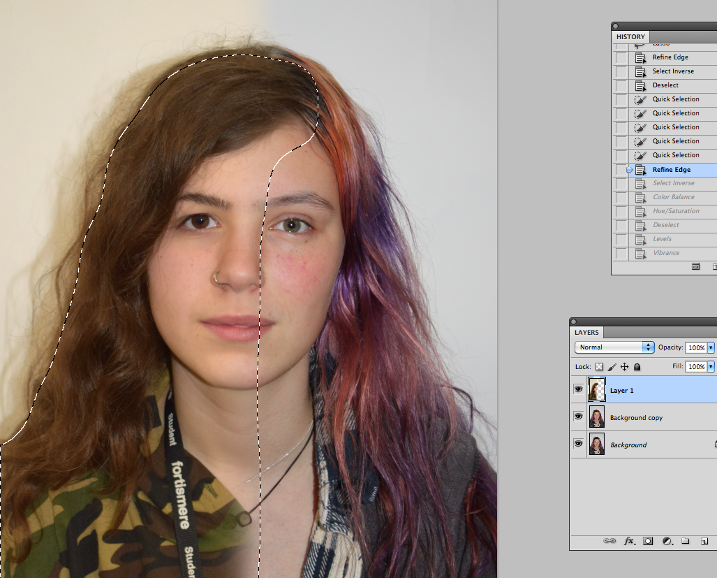
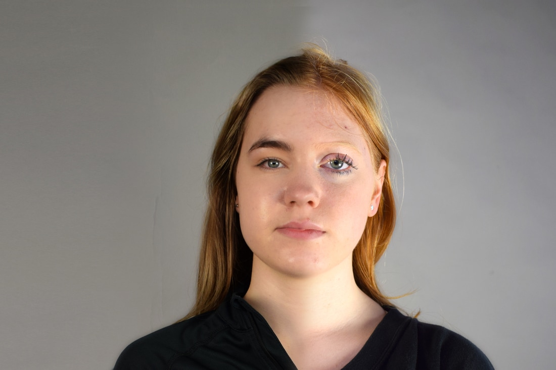
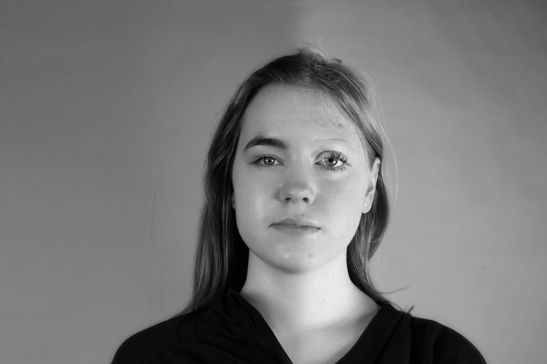
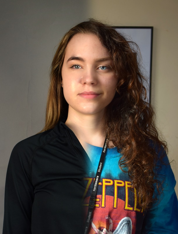
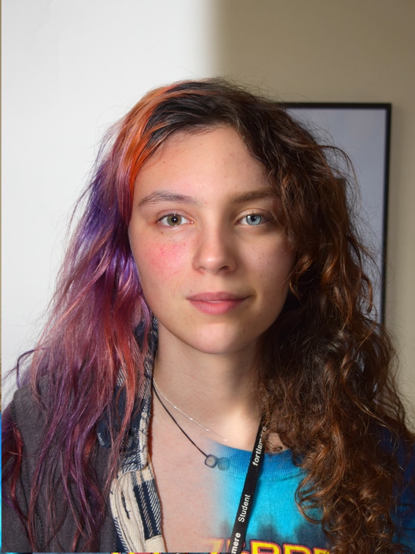
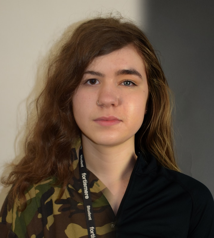
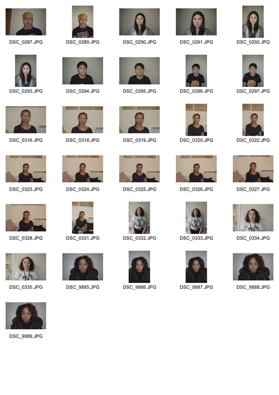
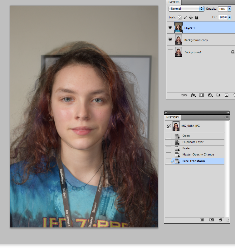
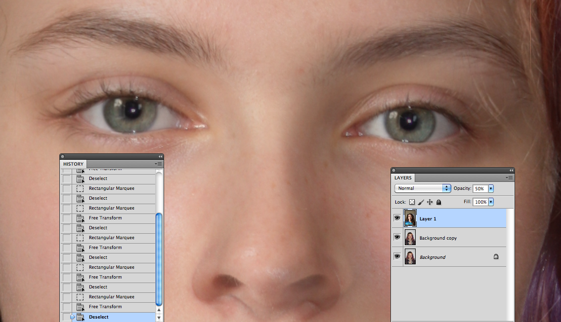
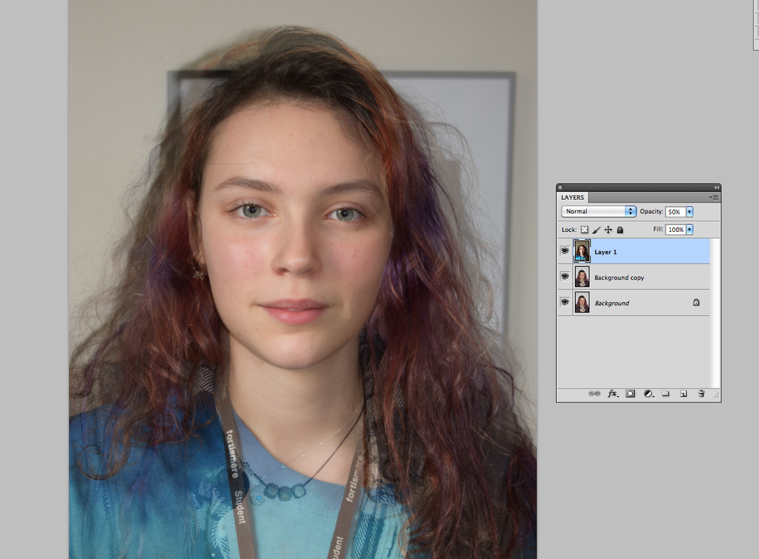
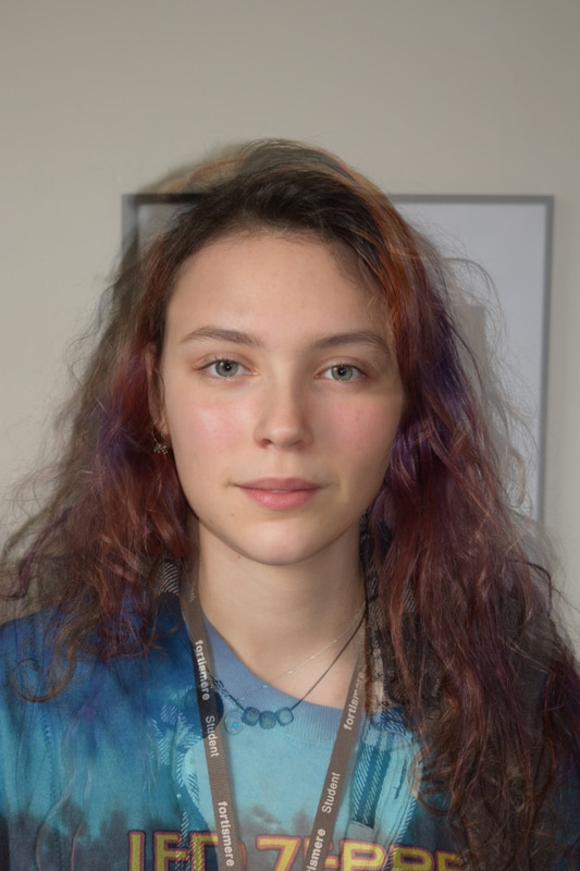
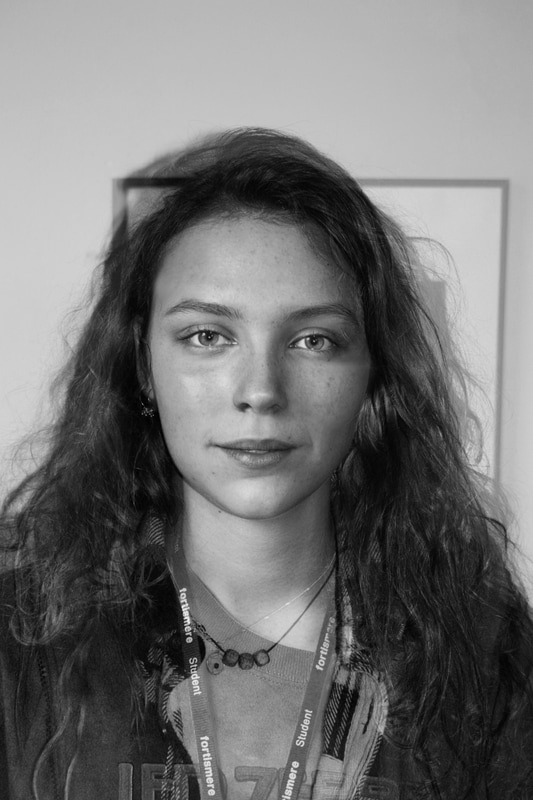
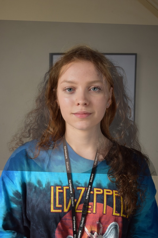
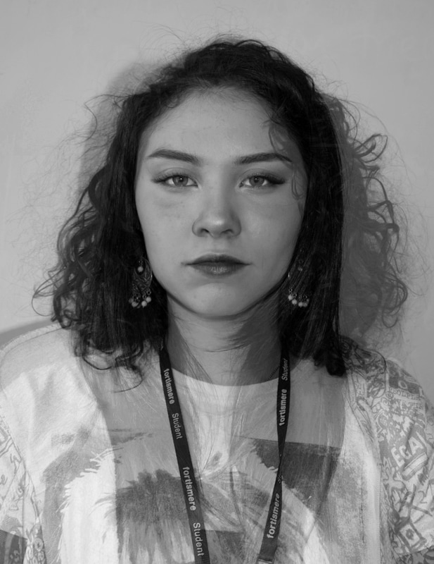
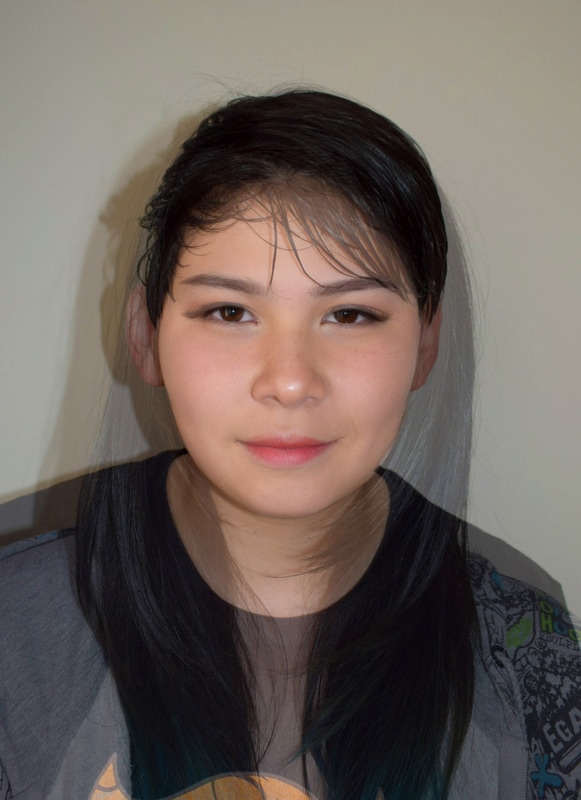
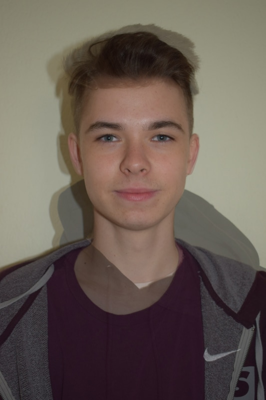
Second strand - combining faces
Bobby Neel Adams
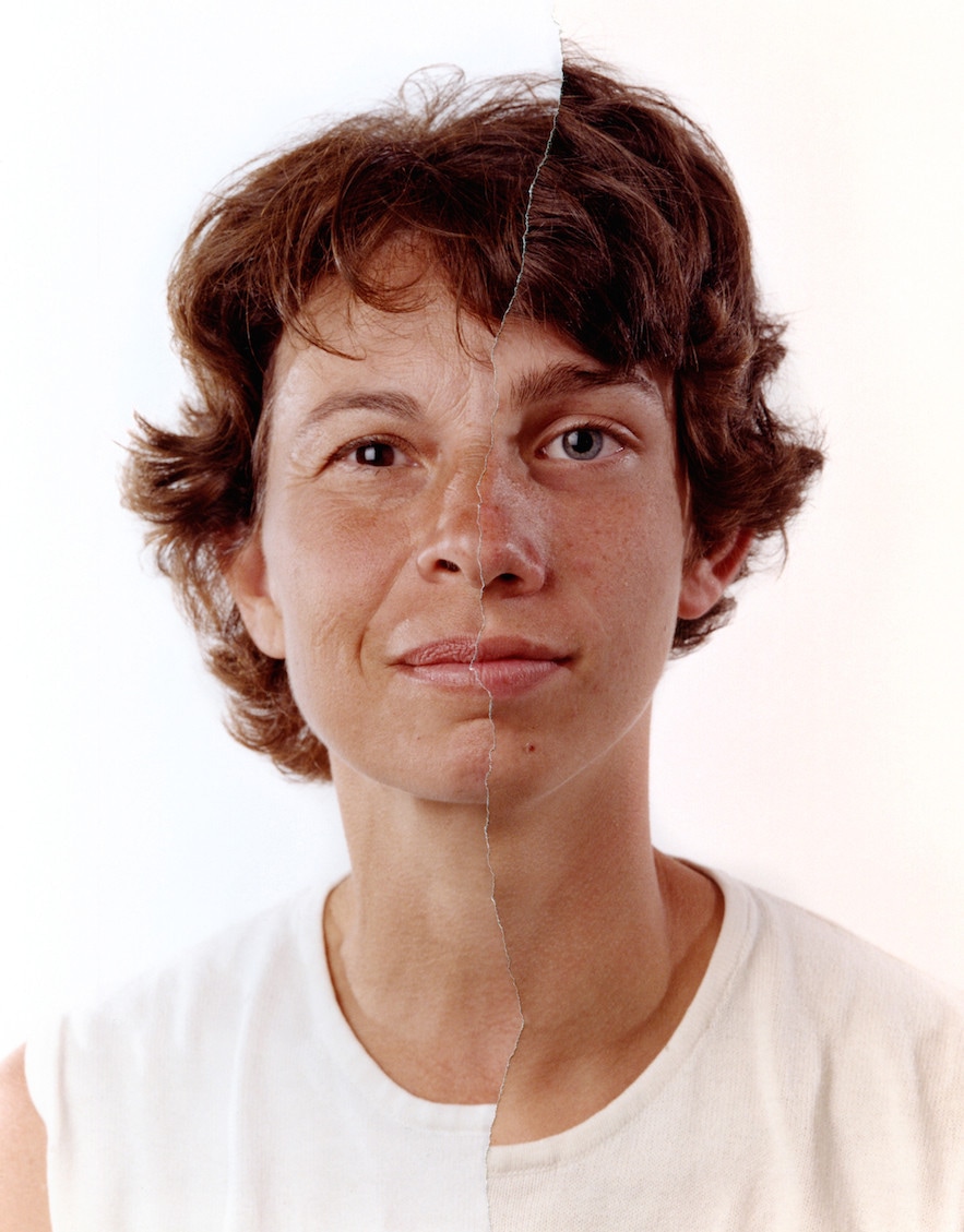
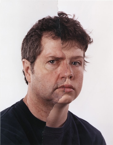
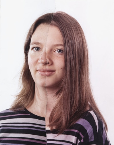
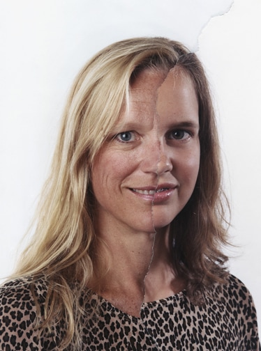
Adams creates surreal images by using pictures of people who are related (parent,sibling etc) and putting the faces facing the same angle together with a ripped effect, making the image distorted but still clear where each person looks similar. The ripped image effect works well with his intentions, kind of revealing another identity.
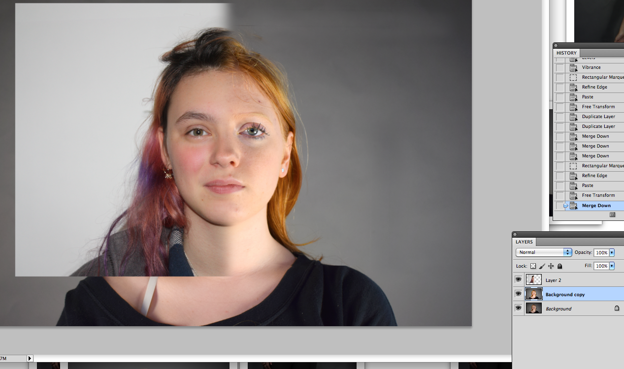
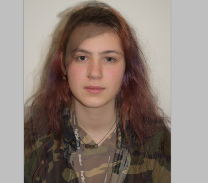
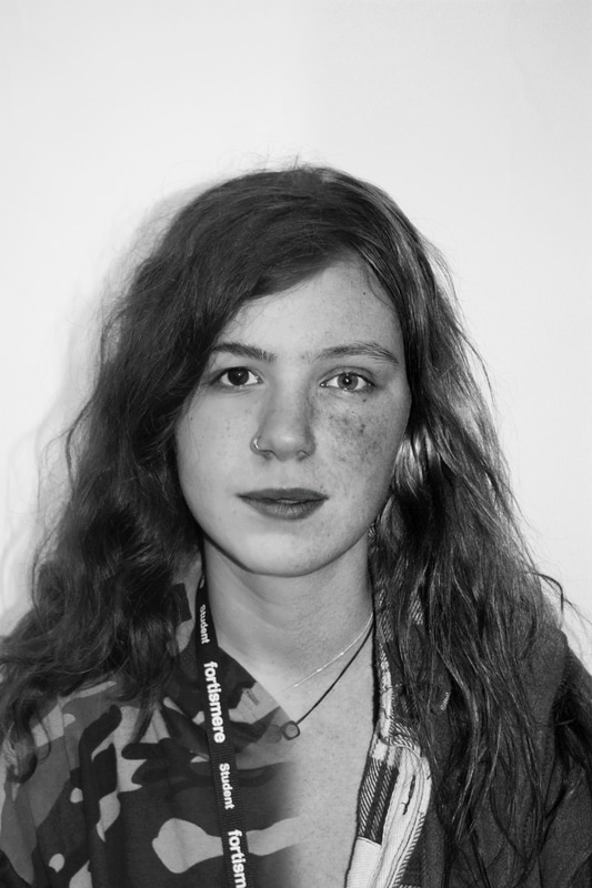
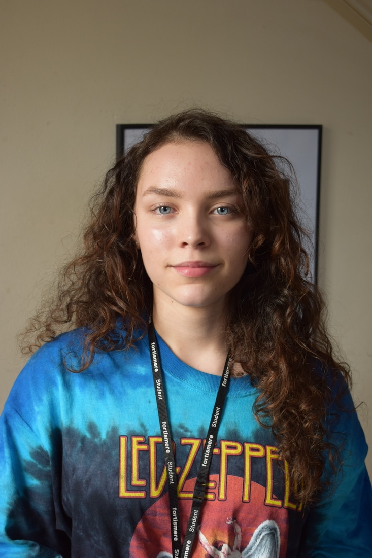
I wanted to take images of people who look similar and those who look different, and merge their faces half and half. I think it would be an interesting approach to the structure of the face, and to see the similarities and differences in how people look. I prefer to blend the faces at the split so its easier to see the similarities.
Some progress screenshots
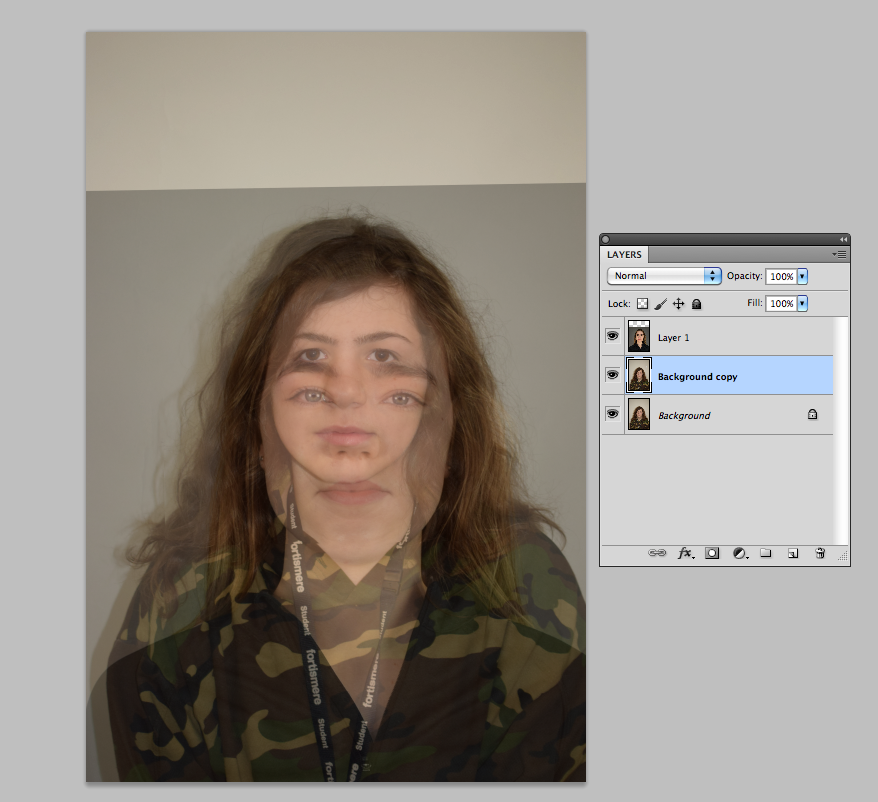
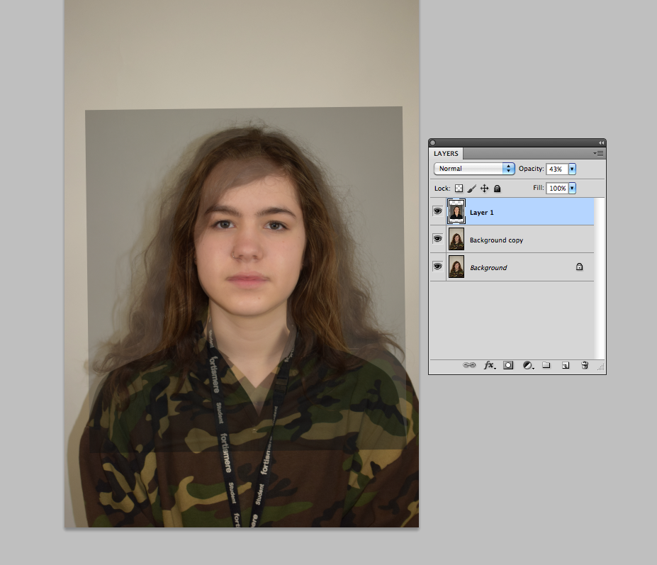


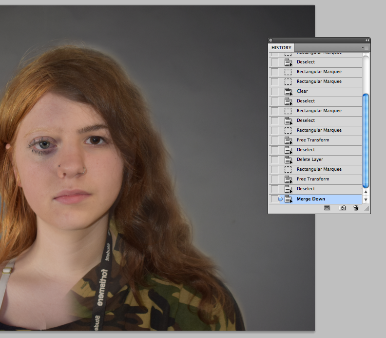
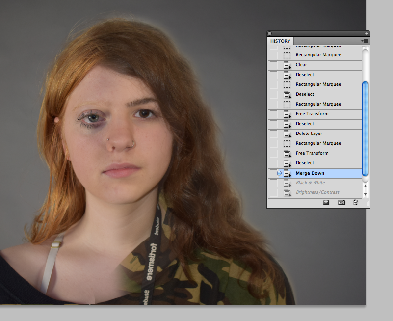


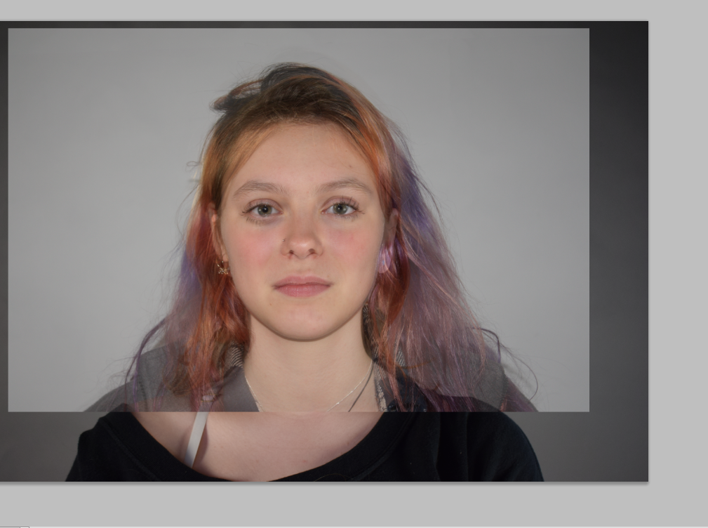
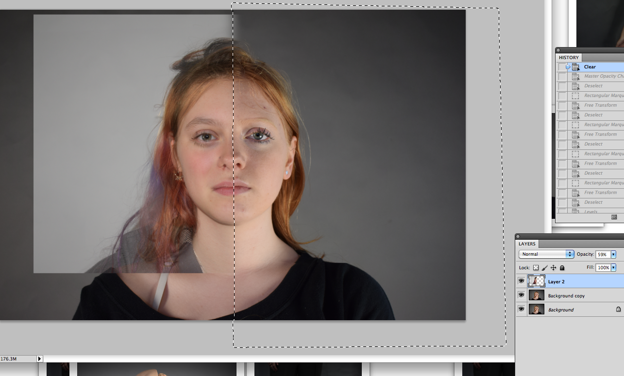
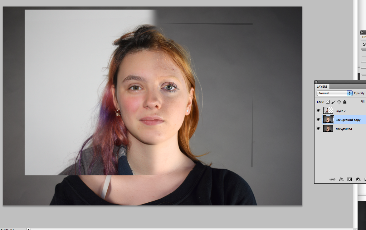
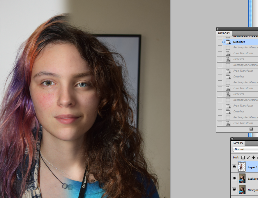
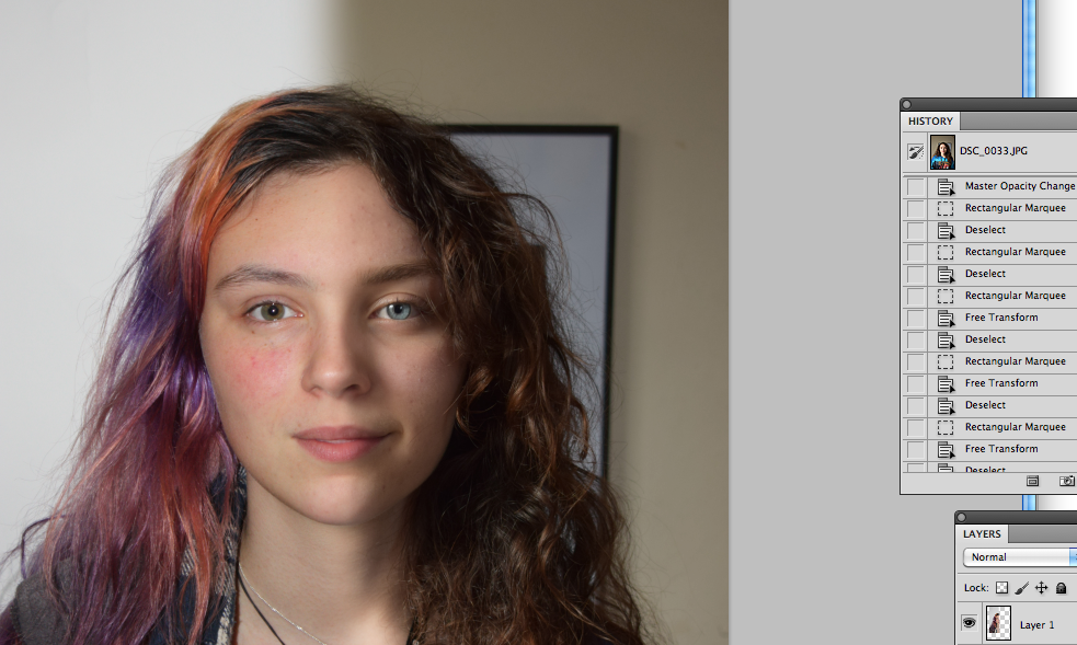
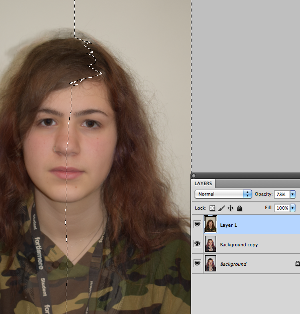
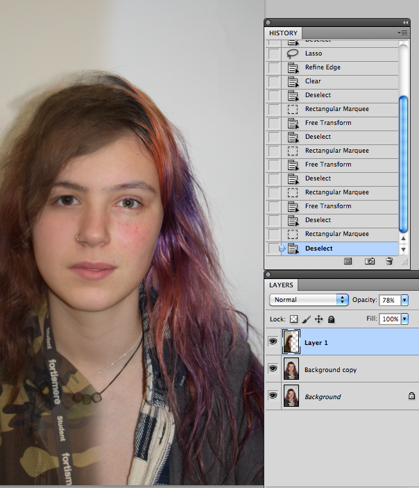
A lot of the time I changed my mind about making the background the same and warping features to make them seem more realistic blended. Another problem I have is the clothes not blending, there's not much I can do about it although I did try.
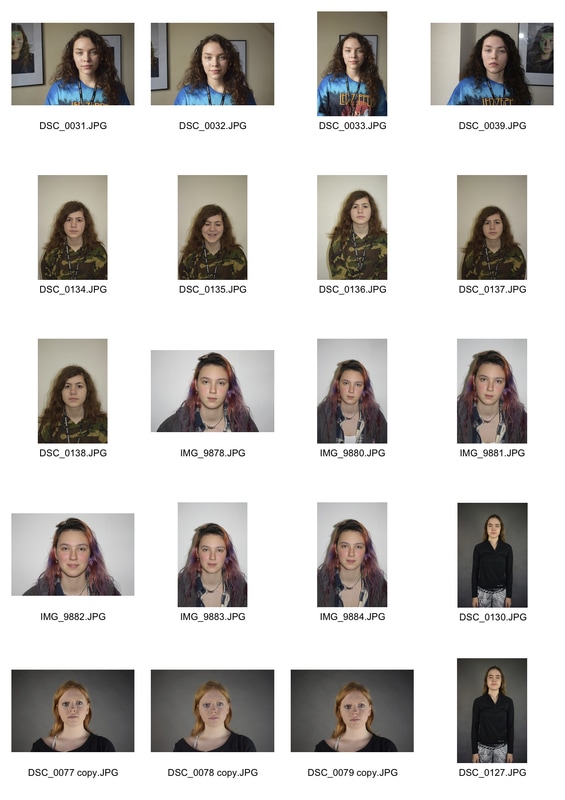
Contact sheet
Edits


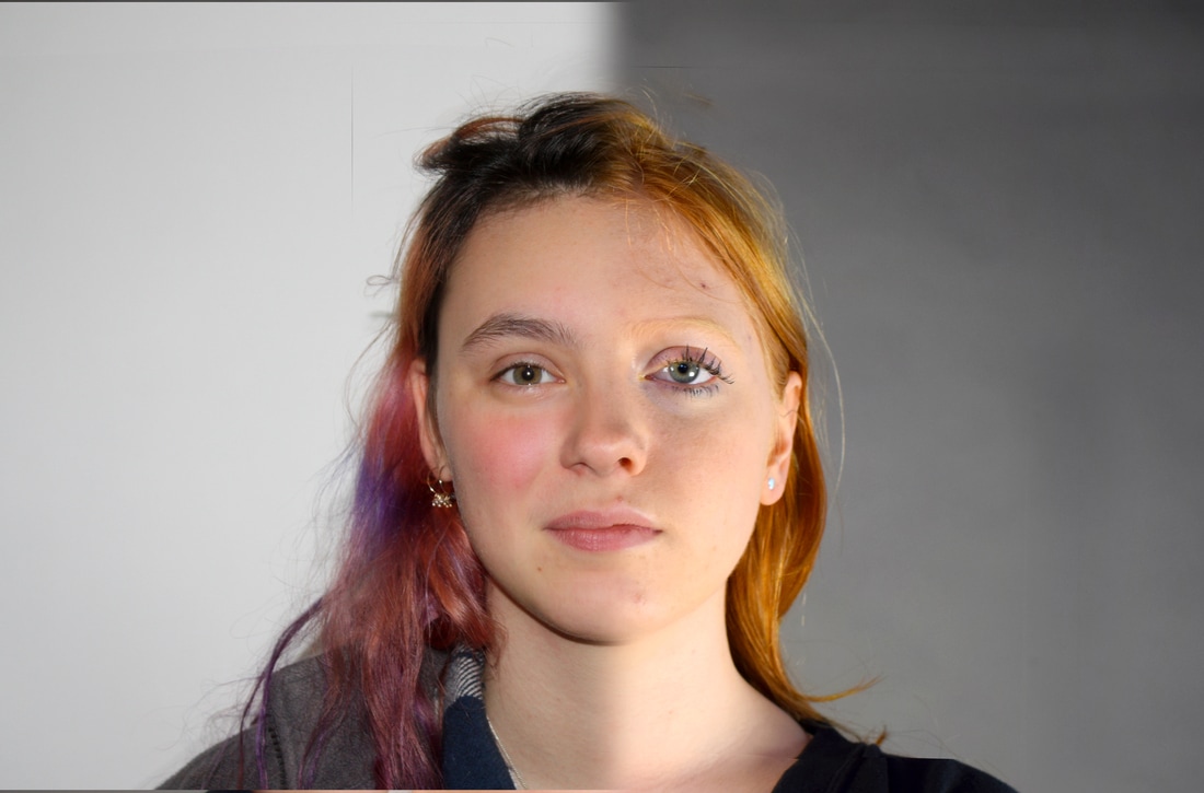
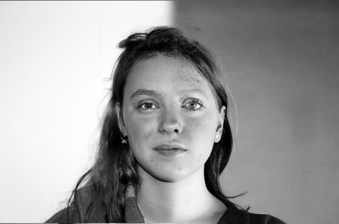

- Some edits worked better than others, as some faces were a good match to blend and others wern't. Overall they generally look smoothly blended, apart from the neck/clothes.
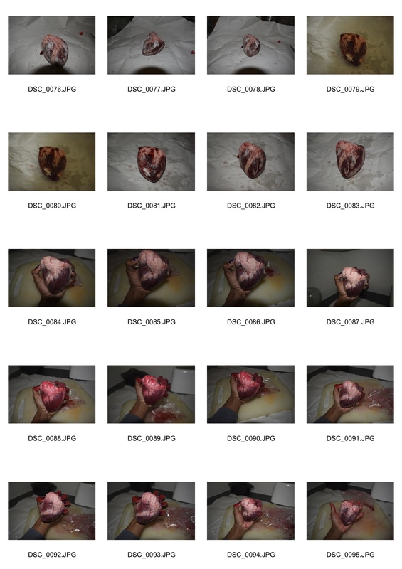
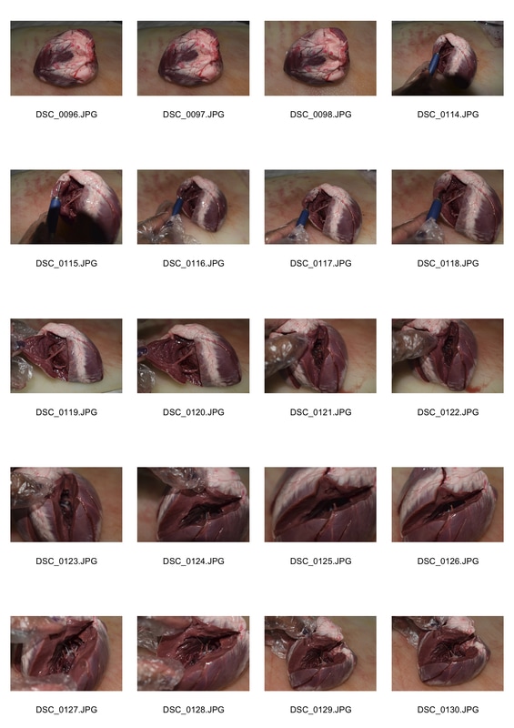
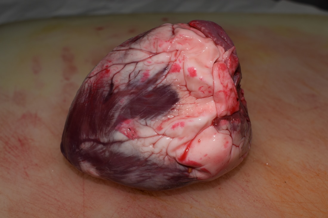
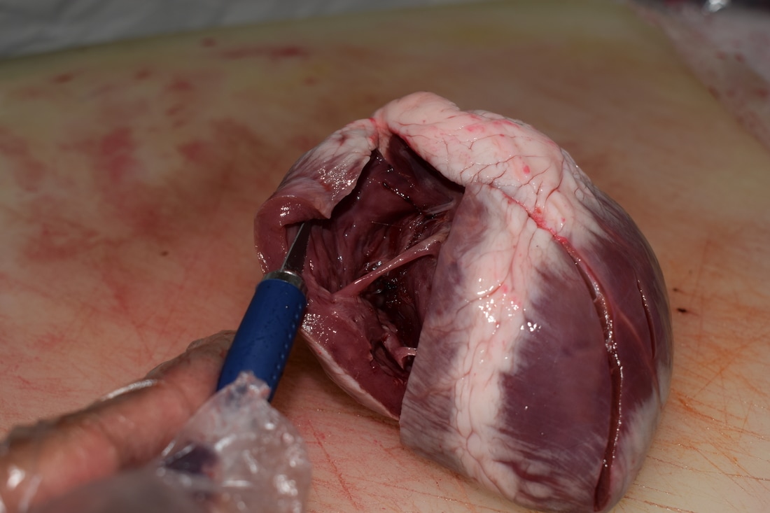
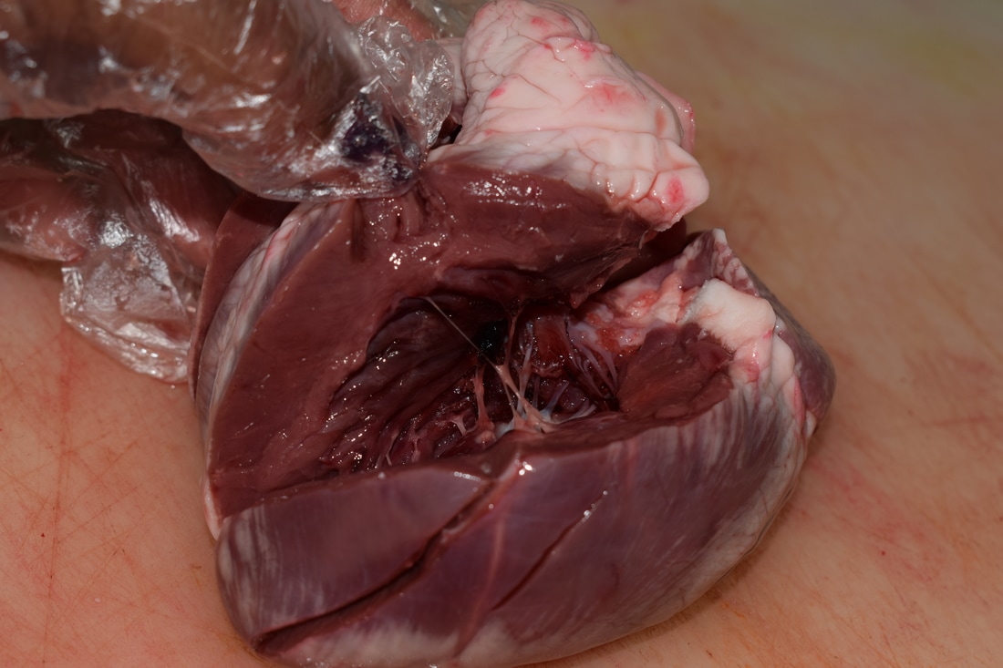
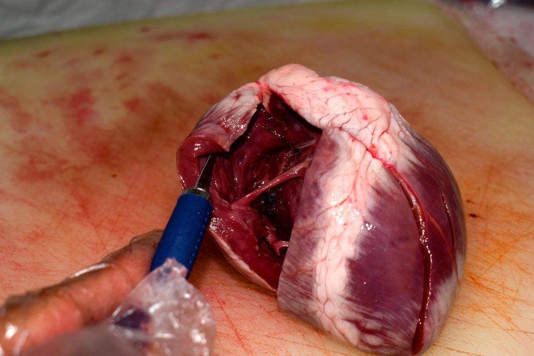
Third strand - structure of the internal body
as a biology student, sometimes we do dissections. It's a great way to understand the structure of the human body in greater depth, and by taking photos of the process I thought it would be good to bring it into photography.
Contact sheets


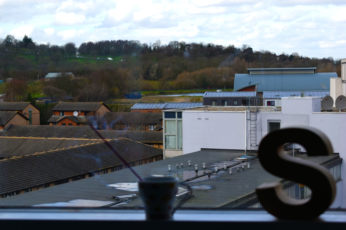
4th Idea - structure of daily life / routine ?
Lorena Arance
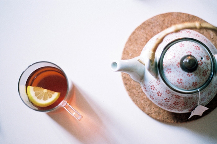
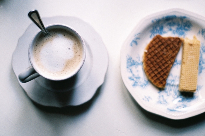
Arance takes aesthetically pleasing pictures of her mornings that highlight the softness of the early hours. I like her work because mornings often consist of rushing, and not taking time to appreciate the smaller things. Her images are a breath of fresh air and make mornings seem more relaxed.
I took a couple images of what I usually do in the morning (eg look out the window, open the fridge) to show the structure of my daily life; I think I could do a lot more to develop this initial idea.

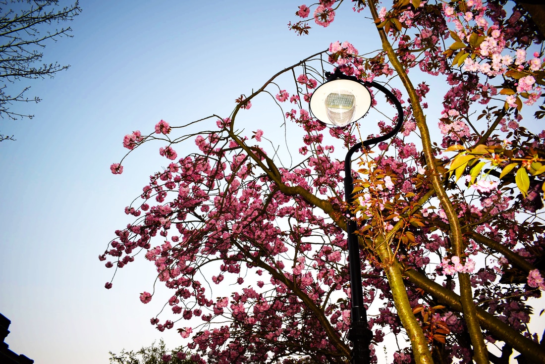
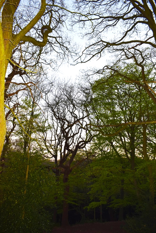
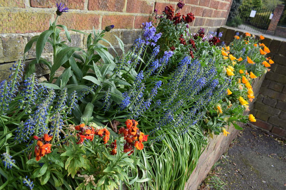
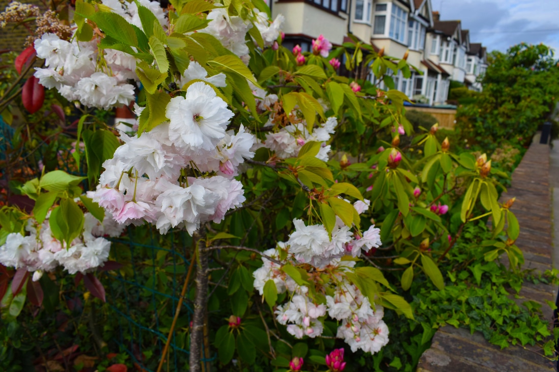
Idea 5 - structure in nature
I went to Queen's wood and enfield to get some pictures of flowers and nature

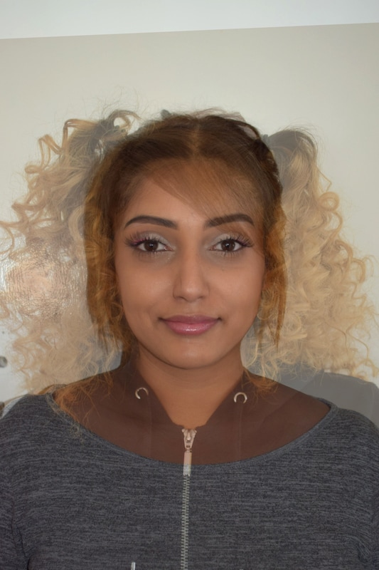
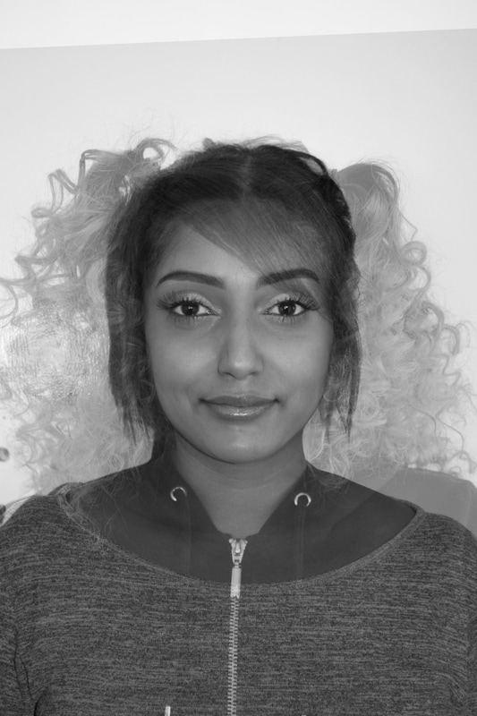
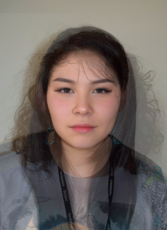
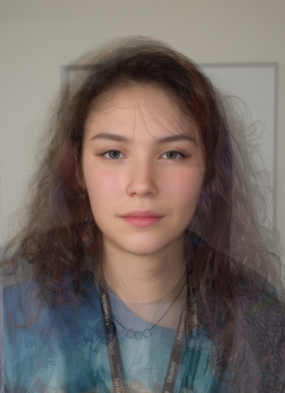
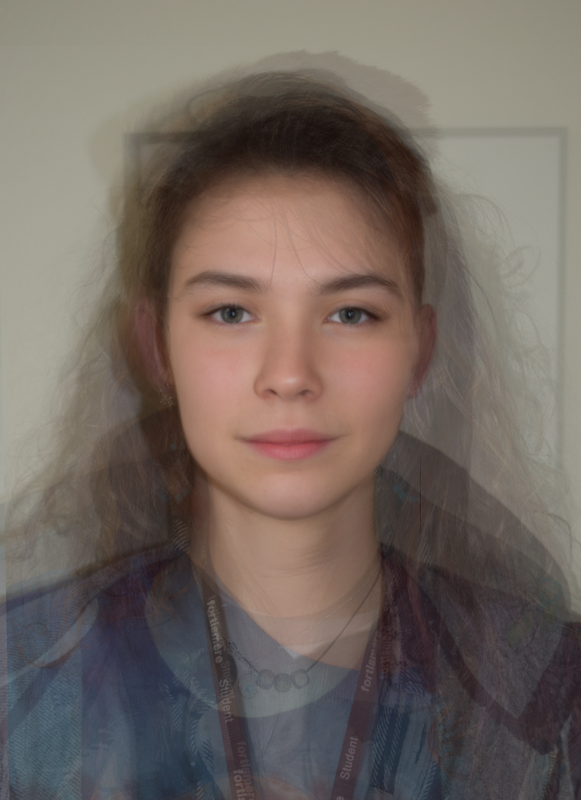
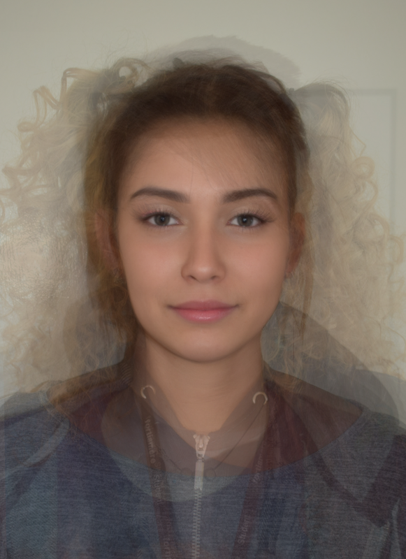
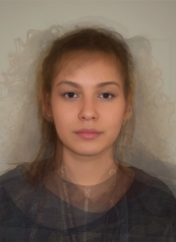
Chosen strand - Face merging/layering
Layering faces creates an average, a face that is real, but also not real. The more layers I do with different people the more everyone looks the same, creating an average face with a more ideal and symmetrical appearance. This makes me think of the debate involving genetic engineering - and eventually designer babies - triggered by the event of crispr, or cas9. The initial creation of crispr was targeted at genetic defects and diseases that make people's lives difficult, and increase infant mortality. However, with the capabilities of crispr, people may think why not give the child a better metabolism, stronger bones etc, which leads to them thinking about changing the child's appearence, why not a different gender, blue eyes, fuller hair, or fairer skin? With the beauty ideals still being slightly different in each country, it brings the question whether in the distant future everyone will look almost identical. It also raises the question of an emerging underclass, those who cant afford to change the genes of their baby, questioning the future of society with such a large gap between the rich and poor.
Contact sheet
Experimenting with layering
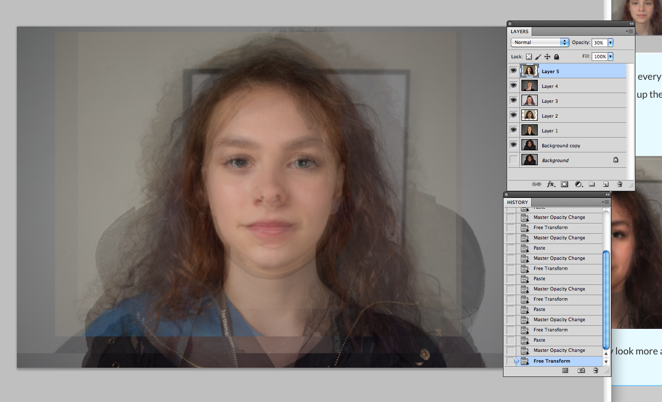
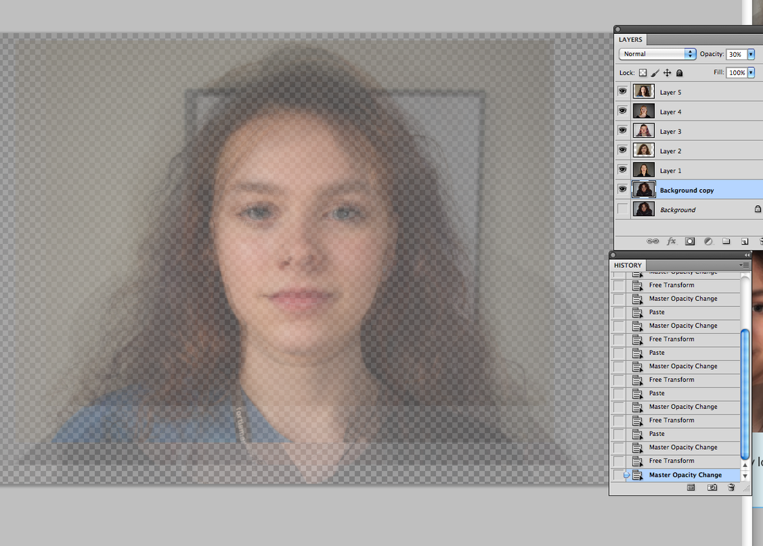
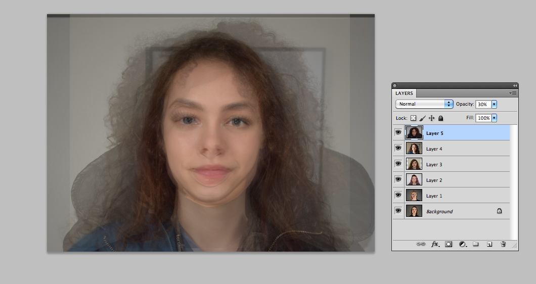
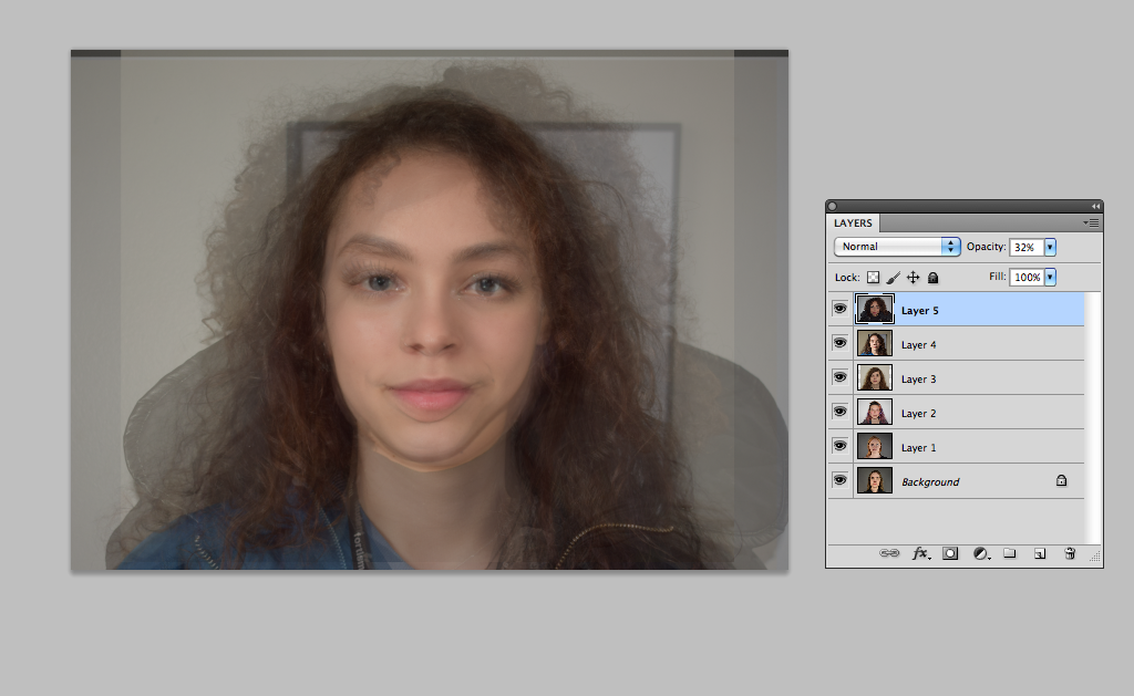
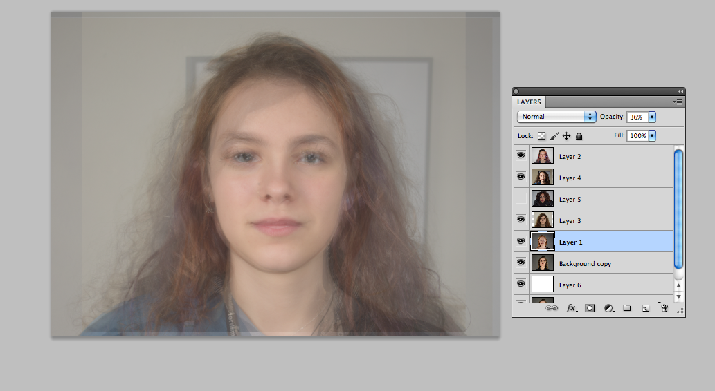

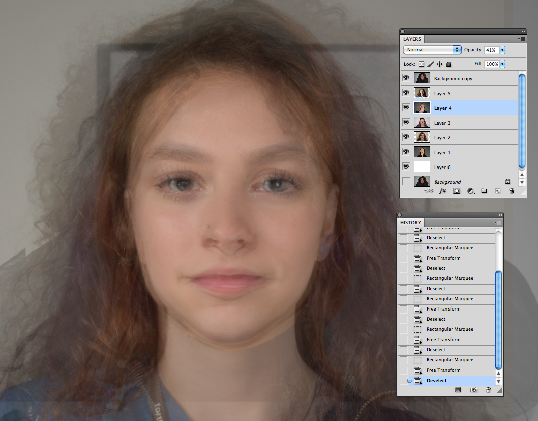
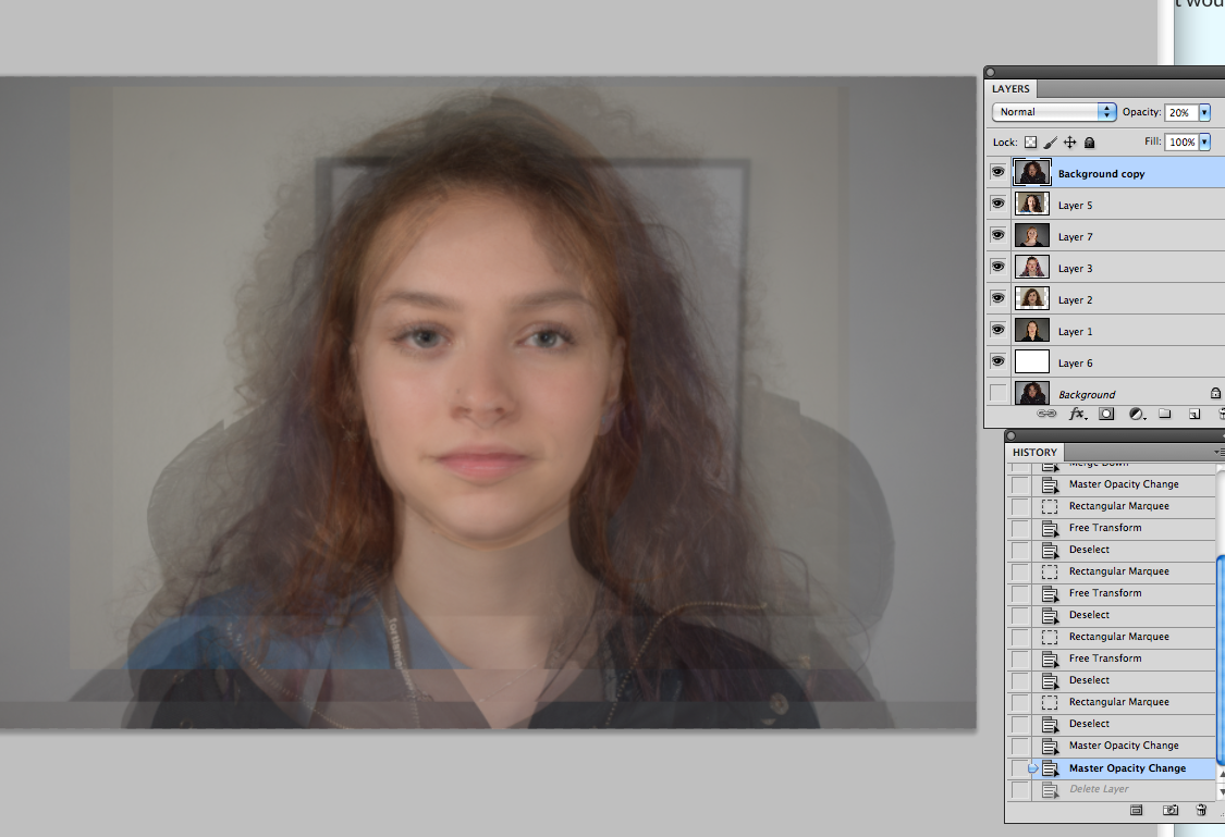
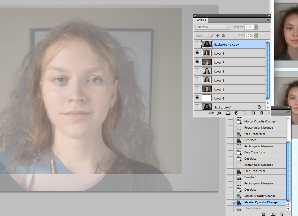

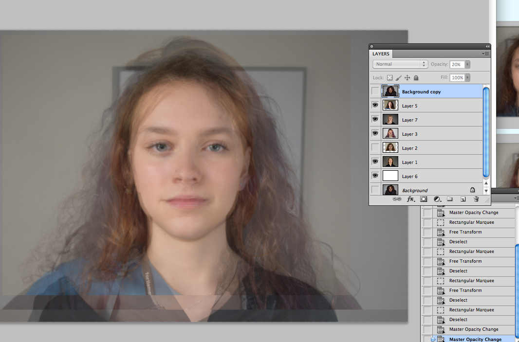


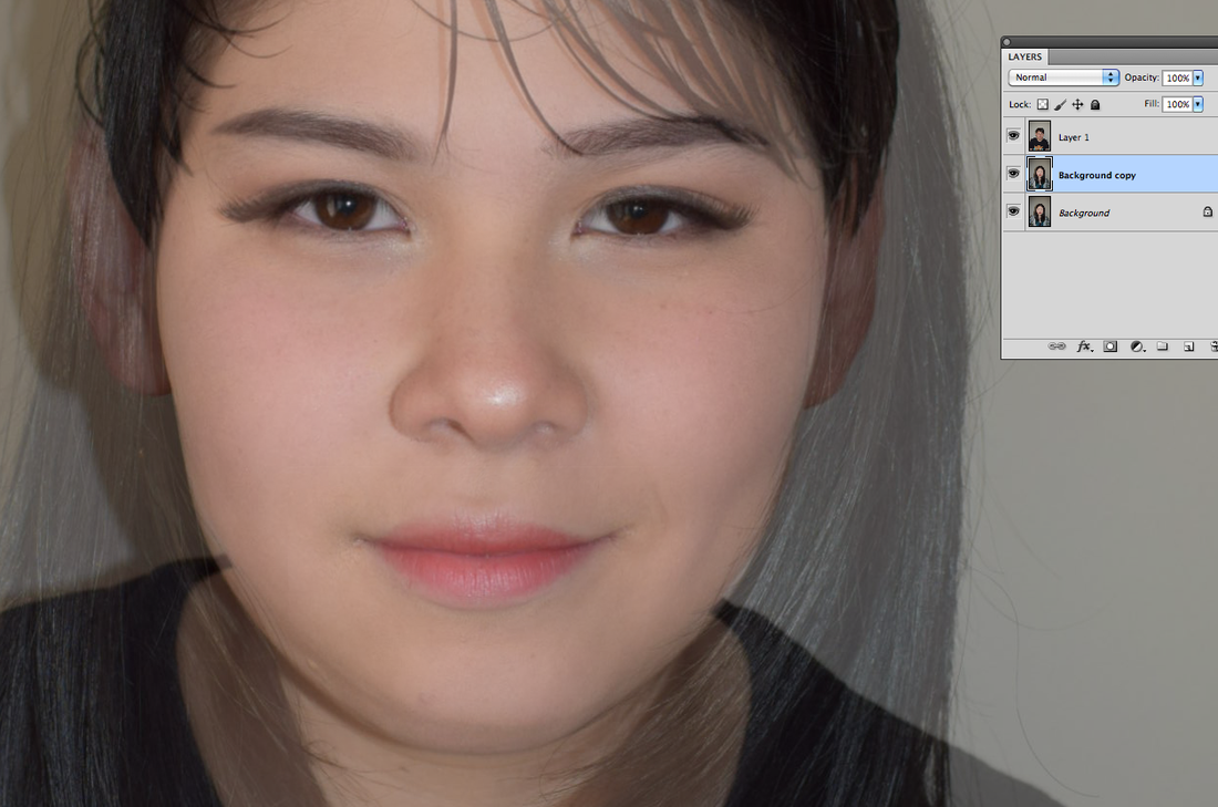
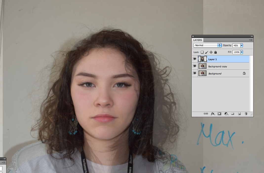
It was hard trying to figure out the opacity for each layer, as even if the opacity is the same for every one, the top layer shows up the strongest. If the bottom layer (being a face) was 100%, then it would come up the strongest. so, for the base I used a white layer to eliminate this.
6 people
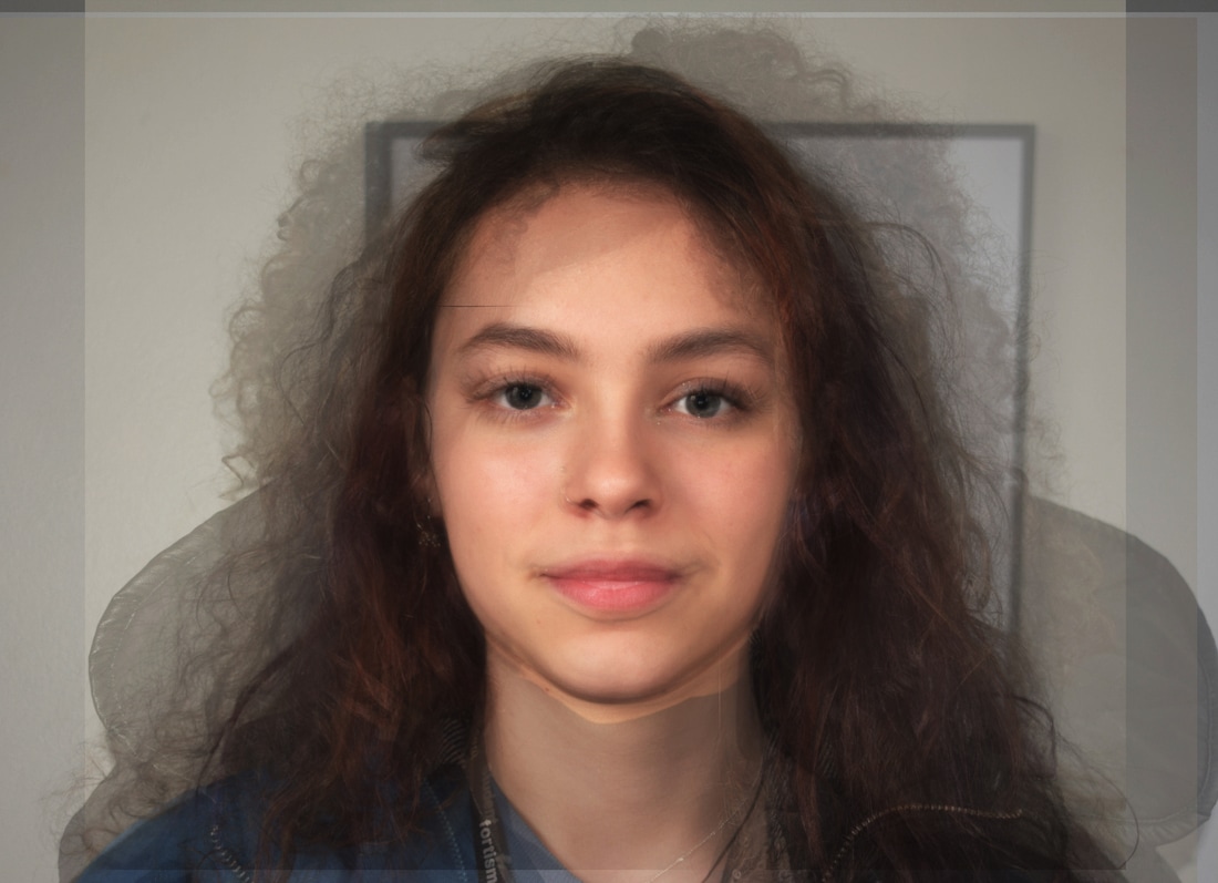
This didn't work because there was too many people with too different looking faces. However, it's interesting that there is a face that almost isn't a face at all. With so many layers, there's a loss of individuality and it's hard to find each person in the face, which links back to designer babies.
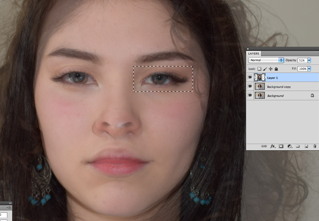
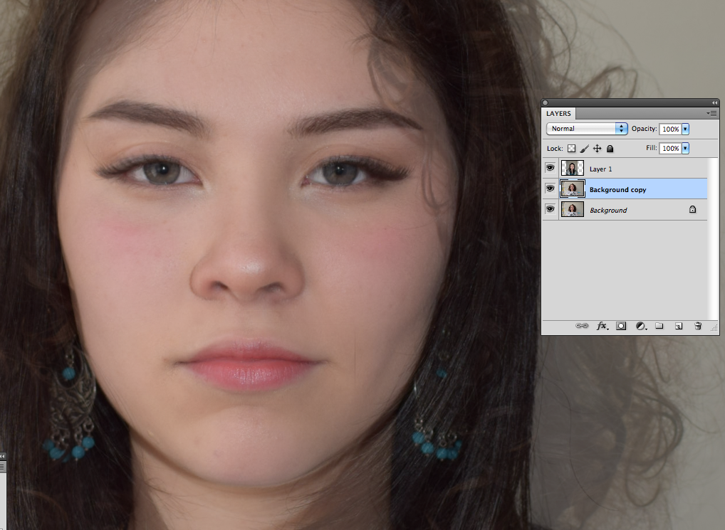
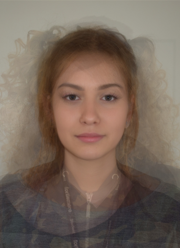
Trial 2
Contact sheet
2 people progress


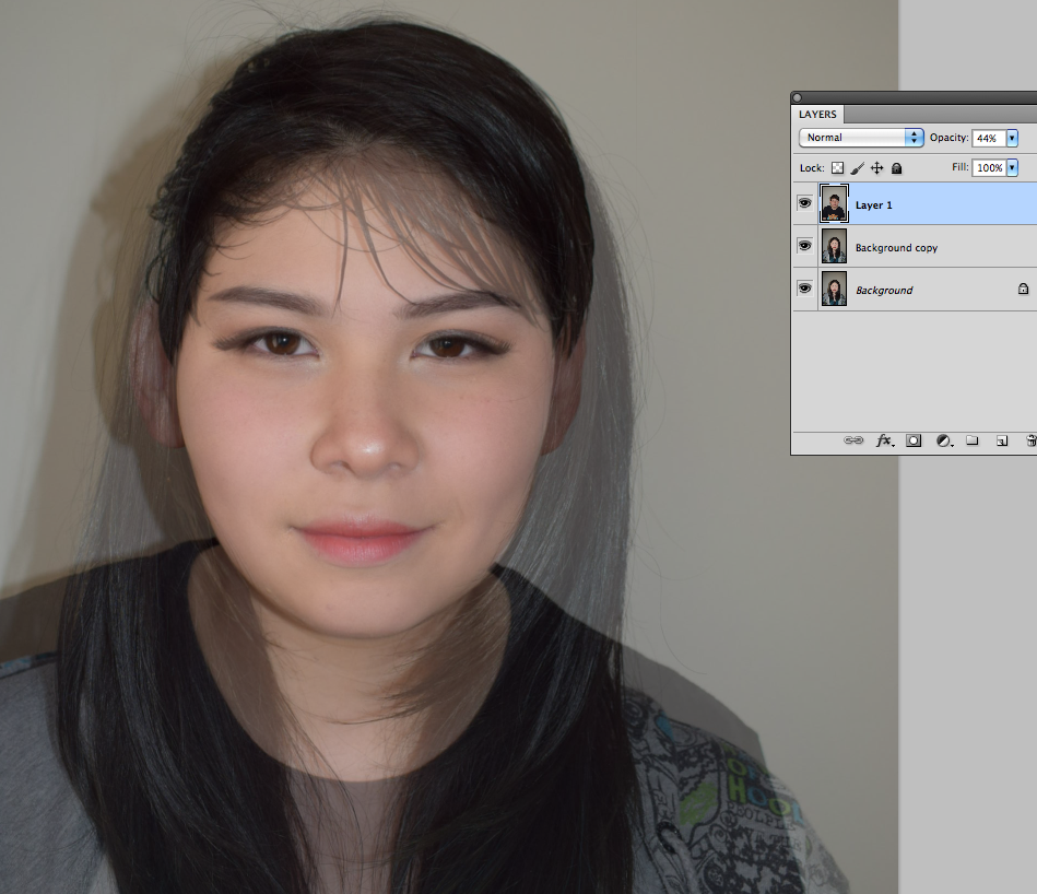

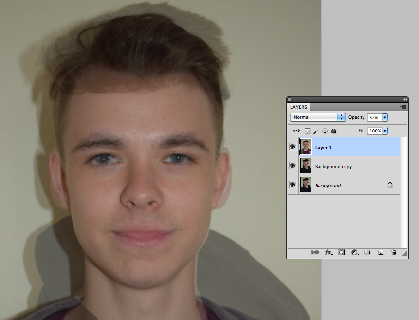
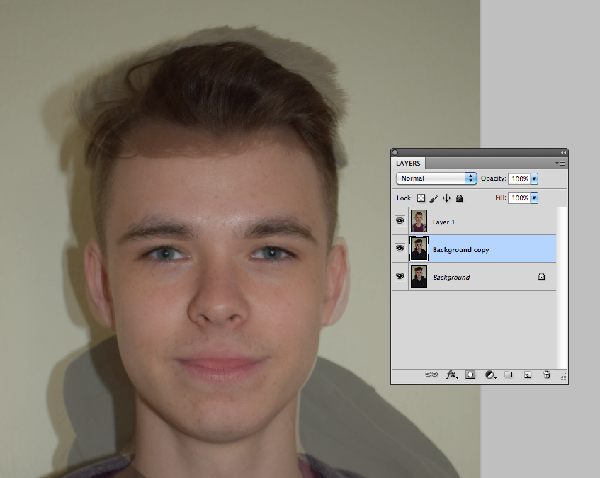

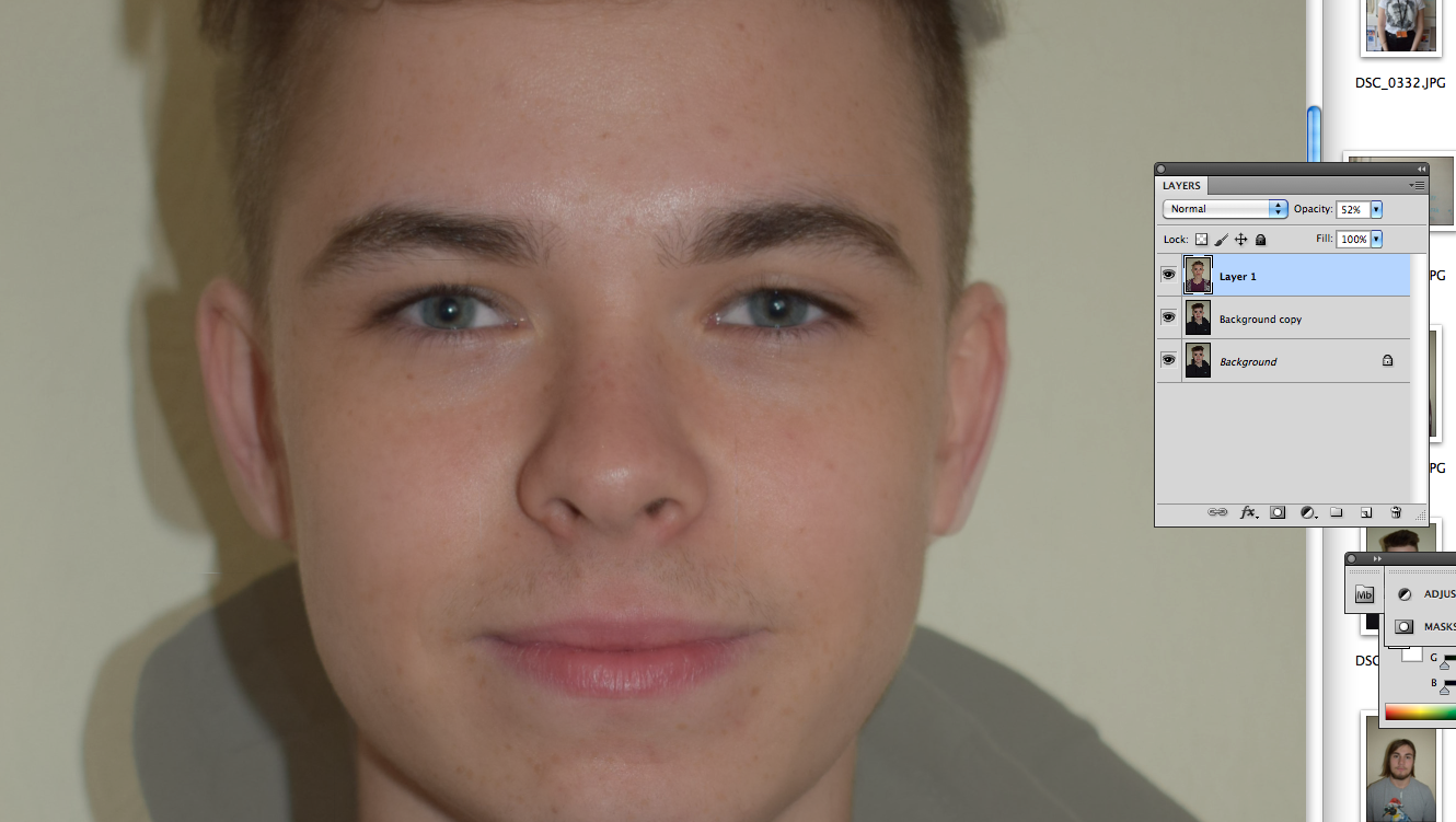
layering can be very difficult, sometimes the features of each person are in completely different places, and you have to shift each feature on each person an even amount so that the average is more accurate, and not just one layer looking like the other. Its often also difficult if the person's head is slightly to the side, at an angle, or not straight on - it distorts the image even further.
Trial 1
layering eliminates asymetrics, making the end result more symmetrical, therefore they look more attractive.
Trial 2


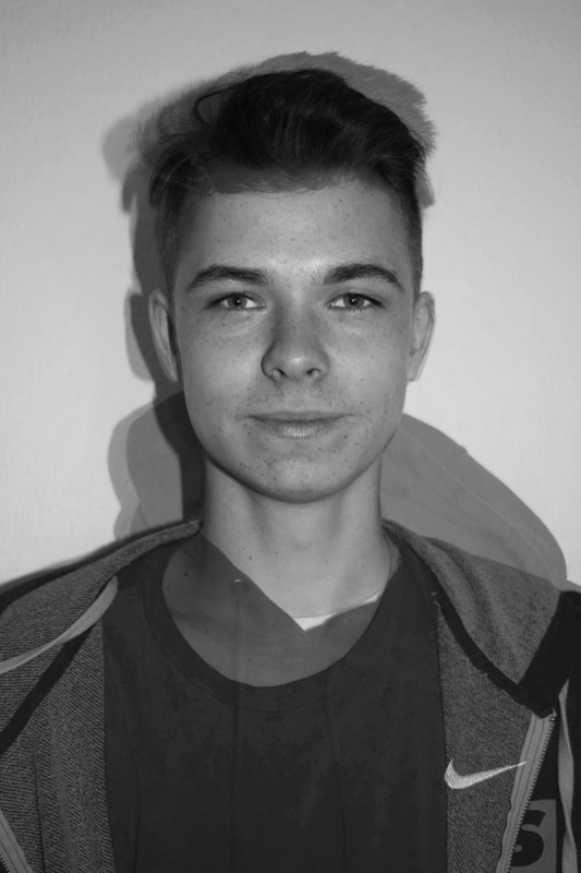
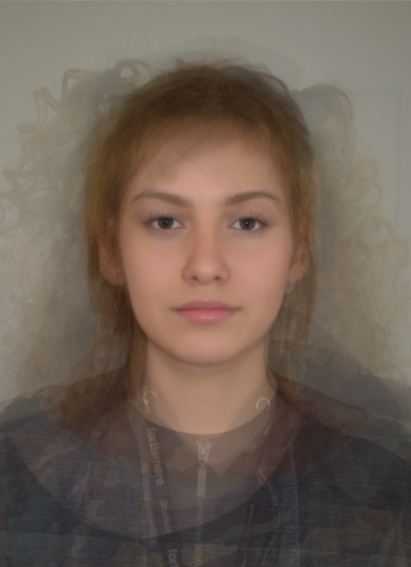
Merging relatives
Brother/Sister, Mother/Daughter

I felt I was mainly using females so I decided to merge two guys. for some reason, it was more difficult.
Exam
process

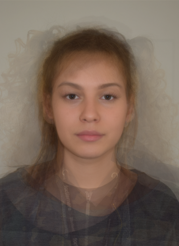
Final frame
GIF

I layered 12 people - at first 2 at a time then one at a time - to create an average that is a face, but also isn't one.
